Basic Customization
EViews allows you to perform extensive customization of your graph views at creation time or after the view is displayed. You may, for example, select your graph type, then click on the other option groups to change the graph aspect ratio, the graph line colors and symbols, and the fill colors, then click on to display the graph. Alternately, you may double-click on an existing graph view to display the dialog, change settings, then display the modified graph. And once a graph view is frozen, there are additional features for adding text, lines, and shading.
We defer a detailed discussion of graph customization to later chapters. Here we describe a handful of the most commonly performed graph view customizations.
You should be aware that many of the options that we describe below are transitory and will be lost if you change the graph type. For example, if you set the symbol colors in a scatterplot and then change the graph to a line graph, the color changes will be lost. If you wish to make permanent changes to your graph, you should freeze the modified graph view or freeze the graph view and then make your change to the resulting graph object.
Frame
The option group controls characteristics of the basic graph view window, including the frame appearance, colors in the graph not related to data, and the position of the data within the frame.
Color & Border
The section of the group contains two sets of options. The group controls fill and background colors, while the group modifies the graph frame itself.
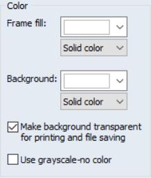
Color
The group allows you to choose both the color inside the graph frame () and the background color for the entire graph (). You may also apply a fade effect to the frame color or background color using the corresponding dropdown menus.
The final two settings are related to the behavior of graphs when they are printed or saved to file. The first option, , should be used to ignore the background color when printing or saving the graph (typically, when printing to a black-and-white printer). Unchecking the last option, , changes the display of the graph to grayscale, allowing you to see how your graph will look when output to a black-and-white device.
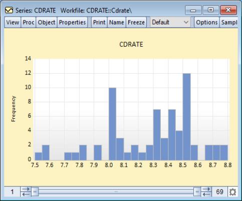
Here, we display a histogram of data on three month CD rate data for 69 Long Island banks and thrifts (“CDrate.WF1”). These data are used as an example in Simonoff (1996).
We have customized the graph by changing the color of the background (obviously not visible if you are viewing this in black-and-white), and have applied a fade fill to the graph frame itself. The frame fill is light at the top and dark at the bottom.
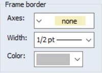
Frame Border
The group controls the drawing of the graph frame. The dropdown describes the basic frame type. The first entry in the dropdown, , instructs EViews to draw a frame line for each axis that is used to display data in the graph. The last entry, , instructs EViews not to draw a frame. The remaining dropdown entries are pictographs showing the positions of the frame lines. In this example, we will display a box frame.
Size & Indents
The section provides options for positioning and sizing the frame. The group controls the height and width of the graph, while positions the data plot inside the graph.
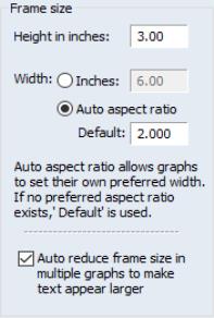
Frame Size
The group is used to control the aspect ratio of your graph and the relative size of the text in the graph. (Note that you can also change the aspect ratio of the graph by click-and-dragging the bottom or right edges of the graph.)
The first two settings, and , determine the graph frame size in virtual inches. You may specify the width in absolute inches, or you may specify it in relative terms. Here, we see that the graph frame is roughly

inches since the height is 3.00 inches and the width is 2.000 times the height.
Note that all text in graphs is sized in terms of absolute points (1/72 of a virtual inch), while other elements in the graph are sized relative to the frame size. Thus, reducing the size of the graph frame increases the relative size of text in the graph. Conversely, increasing the size of the graph frame will reduce the relative size of the text.
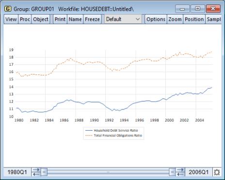
We can see the effect of changing both the aspect ratio and the absolute graph size using our example workfile “Housedebt.WF1”. We display a line plot of the data in GROUP01, with the set to 3, and the to 1. The resulting graph is now three times as wide as it is tall.
There is one additional checkbox, labeled , which, when selected does as advertised. When displaying multiple graphs in a given frame size, there is a tendency for the text labels and legends to become small and difficult to read. By automatically reducing the frame size, EViews counteracts this undesired effect.
Position of graph in frame
The two dropdown menus in control the position of the plot within the graph frame. Note that different graph types use different default settings, but you may override them using the two dropdowns. Using positive values for these settings can help insure that your data points are not obscured by drawing them on top of the axes scale lines.
Axes & Scaling
The option group controls the assignment of data to horizontal and vertical axes, the construction of the axis scales and labeling of the axes, and the use of tickmarks and grid lines.
This group is divided into sections based on the type of scale being modified. There are two different scale types: data scales, and workfile (observation) scales. When series data are assigned to a given axis, the axis is said to have a data scale, since the data for the series are plotted using that axis. Alternately, if observation identifiers are plotted along an axis, we say that the axis has a workfile or observation scale.
Some observation graphs (Line graphs, Bar graphs, etc.) have both data and observation scales, since we plot data against observation indicators from the workfile. Other observation graphs (Scatter, XY Line, etc.) have only data scales, since data for multiple series are plotted against each other. Similarly, analytic graphs (Histogram, Empirical CDF, etc.) have only data scales since the derived data are not plotted against observations in the workfile.
The first two sections in this group, and , relate to settings for the data scales. The third section, , sets options for the workfile (observation) scales. The fourth section, , can be used to add or modify grid lines on any axis.
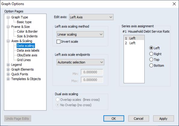
Data scaling
The section allows you to arrange data among axes and set data scaling parameters for each axis.
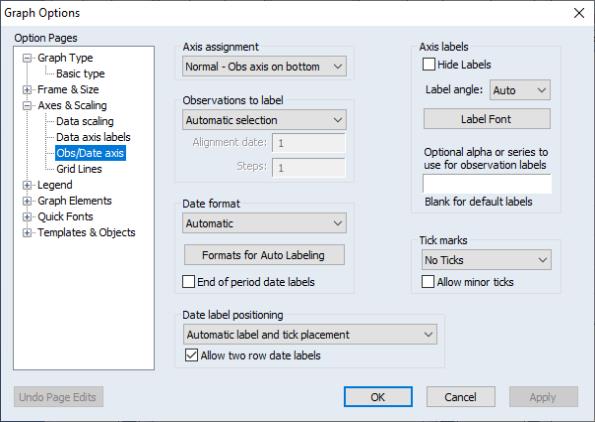
Axis Assignment
The right-hand side of the dialog contains a section labeled which you may use to assign each series in the graph to an axis. The listbox shows each data element along with the current axis assignment. Here we see the assignment for a scatterplot where the first series is assigned to the bottom axis and the second series is assigned to the left axis.
To change the axis assignment, simply click on a graph element in the listbox, then click on one of the radio buttons to perform the desired assignment. Note that when you select an element, the top of the section shows information about the selected data series.
Note that the rules of graph construction imply that there are restrictions on the assignments that are permitted. For example, when plotting series or group data against workfile identifiers (as in a line graph), you may assign your data series to any combination of the left and right axes, or any combination of the top and bottom axes, but you may not assign data to both vertical and horizontal axes. Similarly, when plotting pairwise series data, you may not assign all of your series to a single axis, nor may you assign data to all four axes.
We have already seen one example of changing axis assignment. The dropdown on the page is essentially a shorthand method of changing the axis assignments to display the graph vertically or horizontally (see
“Orientation”).
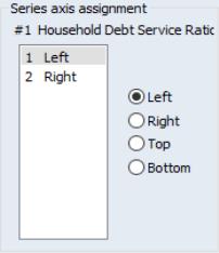
A second common example of axis assignment involves setting up a dual scale graph, where, for example, the left hand scale corresponds to one or more series, and the right-hand scale corresponds to a different set of series.
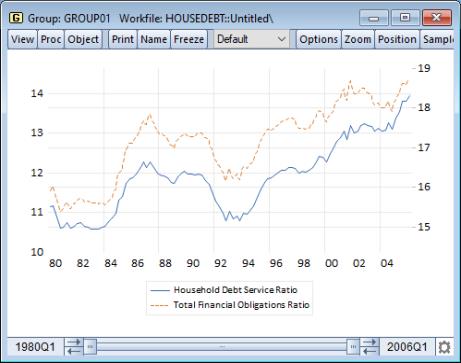
Once again working with GROUP01 in our debt service ratio dataset, we see the display of a dual scale line graph where the first line is assigned to the left axis, and the second line is assigned to the right.
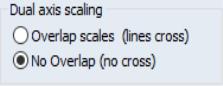
When you specify a dual scale graph with series assigned to multiple axes, the bottom left-hand side of the dialog will change to offer you the choice to select the axis scales so that the lines do no overlap, or to allow the lines to overlap.
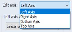
Selecting an Axis to Edit
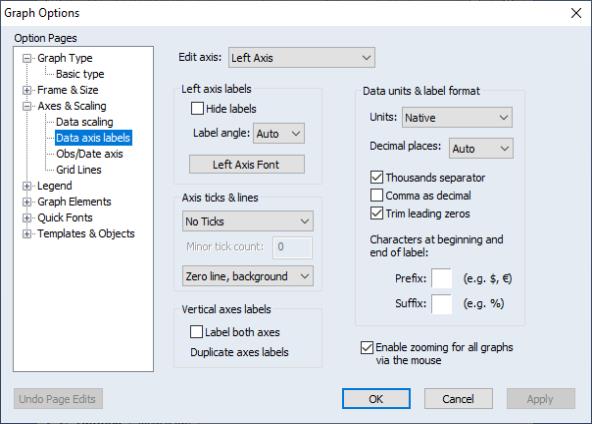
The dropdown at the top of the dialog is used to select a scale (left, right, top, bottom) for modification. When you select an entry, the remainder of the dialog will change to reflect the characteristics of the specified scale.
Defining Data Scales
The remainder of the page allows you to specify properties of the data scale.
We have selected the left axis in our example, so we see the two relevant sections of the dialog labeled and .
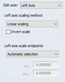
Axis Scale
The describes the method used in forming the selected axis scale.
By default, EViews displays a , but you may instead choose: a linear scale that always includes the origin (), a logarithmic scale (), or a linear scale using the data standardized to have mean 0 and variance 1 (. If you select the option, EViews will reverse the scale so that it ranges from high values to low.
You may use the to control the range of data employed by the scale. If you select , you will be prompted to enter a minimum and maximum value for the scale. Note that if either of these are within the actual data range, the graph will be clipped.
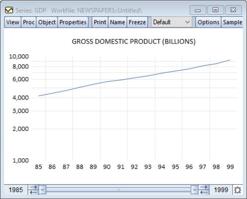
We illustrate log scaling and user-specified axis endpoints using the GDP series from our newspaper advertising revenue data (“Newspapers.WF1”) workfile. In addition to drawing the data with log scaling, we have set the endpoints for our vertical axis to 1,000 and 10,000 (the default endpoints are 4,000 and 10,000).
Note that EViews has chosen to place tickmarks at every 1,000 in the scale, leading to the unequal spacing between marks.
Labeling the Data Axis
The next section in the group is . This section contains options for all characteristics of the data axes which do not affect the scaling of the data.
Similar to the dropdown menu on the page, you may use the dropdown menu at the top of the page to select an axis to edit.
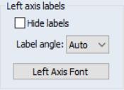
Axis Labels
You may suppress all labels for the selected axis by checking the box.
If you do choose to display labels for the specified axis, you may use the dropdown to rotate your labels. Note that the values in the dropdown describe counterclockwise rotation of the labels, hence selecting in the dropdown menu rotates the axis labels 45 degrees counter-clockwise while selecting rotates the labels 30 degrees clockwise.
Clicking on brings up a font dialog allowing you to change the size and typeface of your labels.
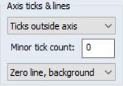
Ticks and Lines
The section controls the display of tickmarks. The first dropdown menu determines the placement of tickmarks: you may choose between , , , and .
If you elect to display ticks, you will be presented with an option for displaying minor ticks as well.
The dropdown controls whether to draw a horizontal or vertical line at zero along the specified axis. The zero line may be drawn in the foreground of the graph (on top of the data) or in the background (under the data). Note that it is possible to draw a zero line for an axis scale that does not include the origin; in this case, the line will not be visible.
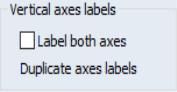
Duplicating Axis Labels
For a graph with all data series assigned to one horizontal or one vertical axis (or, at most, one vertical and one horizontal in the case of an XY graph), the bottom left-hand side of the dialog offers you the choice to . This option will duplicate the labels onto the corresponding empty axis. For example, for a graph with all series assigned to the left axis, you may elect to label the right axis with the same labels by checking this box.
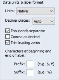
Data Units & Labels
The group can be used to label your axis using scaled units or to customize the formatting of your labels.
• The dropdown menu allows you to display your data using a different scale. You may choose between the default setting , , , , , and . For example, selecting will display the data in units of a thousand; it is equivalent to dividing the data by 1,000 before graphing. Similarly, selecting effectively multiplies the data by 100 prior to display.
• The dropdown specifies the number of digits to display after the decimal. In addition to the default setting, you may choose any integer from 0 to 9.
• The option controls whether numbers employ separators to indicate thousands. By default, EViews will display a separator between thousands (e.g., “1,234” and “2,123,456”, or “1.234” and “2.123.456” if is selected), but you may uncheck the option to suppress the delimiter.
• The option controls whether the comma is used as the decimal delimiter. If checked, the decimal and comma indicators will be swapped: the decimal indicator will be the comma instead of the period, and the thousands separator, if used, will be the period instead of the comma.
• By default, EViews will trim leading zeros in numbers displayed along the axis, but you may uncheck the default zeros checkbox to display these zeros.
• In addition, you may provide a single character prefix and/or suffix for the numbers displayed along the axis.
For example, suppose that we have data that are expressed as proportions (“0.153”). To display your axis as percentages (“15.3%”), you may select as the , and add “%” as the suffix.
Defining Observation Scales
The third option group under is . This page should be used to define all aspects of the workfile or observation scale.
For graphs which do not have a date axis, such as XY graphs, the dropdown menu in the top left-hand corner of the page will read , and any changes to the settings on this page will be irrelevant for the current graph type.
Rotating the Graph
If you are working with a graph which has a date axis, this dropdown menu provides you with a shortcut for rotating the graph. You may select or . Choosing the latter will move the date axis to the left-hand axis and reassign all remaining axes to the bottom axis. The dropdown menu provides the most common options, assigning to either the left or bottom axis. Note that the same results may be accomplished using the control on the page, as discussed above.
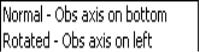
Date Label Frequency
The group controls the frequency with which labels are displayed on the axis. For workfiles with a date structure, you may choose between , , , where you specify an anchor position and number of steps between labels, and other settings based on a date frequency. Only the first four settings are available for workfile scales that do not have a date structure. Some of the dated custom settings are not available for workfiles with low frequencies (e.g., Custom (Step = Quarter) is not available in annual workfiles).
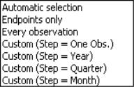
When you select any of the custom settings, EViews offers you the and edit fields where you will fill in an alignment position and a step size. EViews will place a label at the alignment position, and at observations given by taking forward (and backward steps) of the specified size.
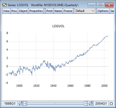
We illustrate custom date labeling by specifying 20 year label intervals for our LOGVOL series from our stock data workfile (“NYSEvolume.WF1”), by putting “1900” in the edit field, and by entering “20” in the field.
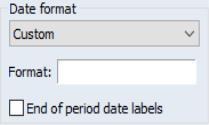
Date Label Formatting
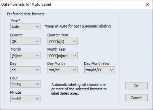
The section allows you to select the method of forming labels for the date axis. You may use the dropdown to select the default , in which EViews will choose an appropriate format, you can select from alternatives that display strings made up of various parts of the dates, or you may select , which allows you to specify a fully custom date format string. Depending on your choice, you will be prompted for additional formatting information. You may also use the checkbox to tell EViews to use the end of period date for an observation when constructing its label.
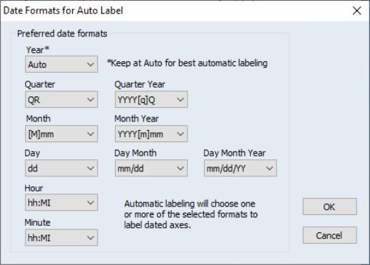
For example, using the default setting, EViews will provide automatic date formats using a default set of guidelines for displaying dates. If you would like to exert some control over the guidelines, you may click on the button. This brings up the dialog, in which you may specify your preferred formats without locking the graph to a specific date string.
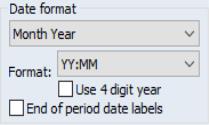
Alternately, you may decide that you always want your labels to be formed using both the month and year of the observation. If you select from the dropdown, EViews will display an additional drop-down specifying how the month/year string is to be formatted. For date formats that include a year, click the checkbox to update all formats in the drop-down to a 4 digit display.
If you would like complete control over the display of your date strings, you should select . The dialog will change to provide an edit field in which you should specify a date format using a standard EViews date format specifications in the edit field (see
“Date Formats”).
If you would like EViews to continue to provide automatic date formats, but would prefer some control over its choices, leave the default setting and click the button. This brings up the dialog, in which you may specify your preferred formats without locking the graph to a specific date string.
Observation scales without a date structure are always labeled using the setting.
Date Label Positioning
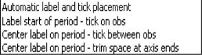
The group determines whether the labels are centered over period intervals, or whether they are placed at the beginning of the interval. You may change the setting in the dropdown menu from the default to label the start or center of the period.
instructs EViews to place the label at the beginning of the period, and the tick on the observation. If you select , EViews places the ticks between observations and centers the label over the period.
The last option, , is essentially the same as the previous option, , except that the empty space on either end of the date axis will be removed. The beginning of the first period and end of the last period will fall at the edges of the graph frame, taking into account any indent set in the page in the option group.
Depending on the frequency of your graph, date labeling can be made clearer if we include a second row of labels. Checking the box allows EViews to utilize a second row of labels where appropriate. For example, daily data can be labeled first by month, with a second row of labels indicating the year.
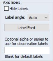
Axis Labels
The group on the page allows you to modify label characteristics such as angle and font for the time axis. These options are similar to those discussed above for data axis labels. However, on the time axis, you can also customize the text of the labels.
The top half of the group mimics the behavior of the controls found in the group on the page.
The bottom half of the group allows you to specify custom observation axis labels. See
“Adding Custom Labels” for further discussion.
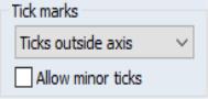
Tick Marks
The dropdown menu in the section determines the placement of tickmarks: you may choose between , , , and . The checkbox determines whether smaller ticks are placed between the major ticks.
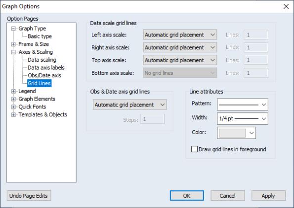
Grid Lines
The final section of the group, , controls grid lines for all axes.
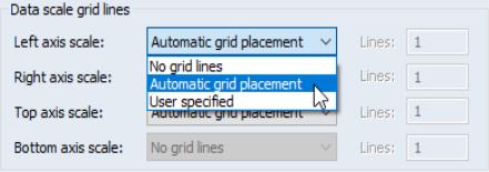
Data Scale Grid Lines
You may use the group to add grid lines to your graph using the dropdown menus. Left axis scale grid lines originate from the left vertical axis; those from the right correspond to the right vertical axis. Top and bottom grid lines are drawn from the corresponding horizontal axes.
You may choose between , , or . If you select the latter, you will be presented with an edit field for you to enter the number of grid lines to draw.
Here we see the automatic placement of left axis horizontal grid lines.
Notice that the menu is disabled in this example, indicating that the date scale for our current graph is assigned to the bottom axis, so the group should be used to control grid lines for this axis.
Note also that if an axis associated with a specified grid line is not in use, the corresponding grid line option will be ignored.
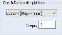
Date Axis Grid Lines
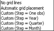
The group applies grid lines to the observation or date axis. The first option in the dropdown, , is self explanatory. The second option, , allows EViews to place grid lines at intervals it deems appropriate for the given frequency and range.
The remaining options in the dropdown menu allow you to add grid lines at specified intervals, with different intervals available based on the frequency of your workfile. After specifying a step length in the dropdown, enter a value for the number of steps between grid lines in the edit field.
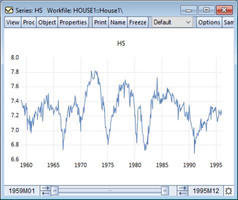
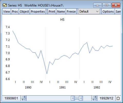
For example, suppose we have data on monthly housing starts over the period 1990M01-1992M12 (a line graph of series HS in the workfile “House.WF1”). When we turn on grid lines and select , EViews opts to draw a grid line at the end of each year.
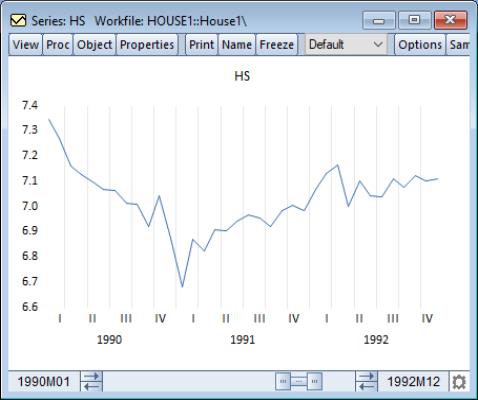
However, we might like the grid lines to show a bit more granularity. You may change the grid setting to and enter “2” in the field. EViews then draws a graph with a grid line every other month.
Similarly, if we change the grid setting to and enter “2” in the field, EViews will now display the graph with a grid line drawn semi-annually.
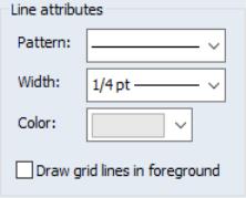
Grid Line Attributes
You may modify the appearance of grid lines in the group. Use the dropdown to select a line pattern, the dropdown to modify the grid line width, and the dropdown to update the line color. The option can be useful for filled graph types, such as bars or areas. Note that all grid lines will be modified with these settings.
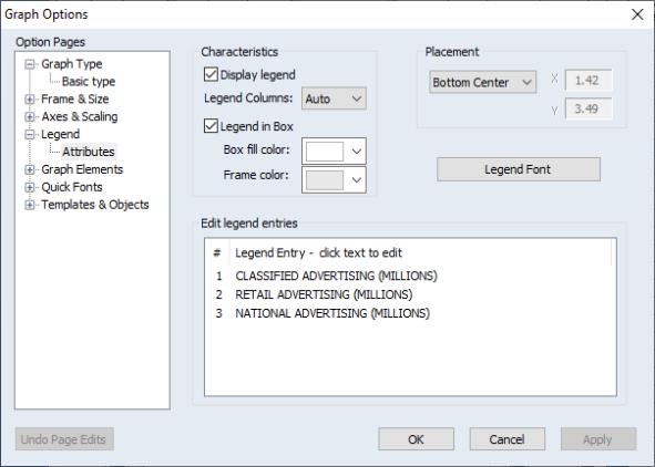
Legend
The next main category in the graph options dialog is . This section provides control over the text, placement, and appearance of the legend.
Legend Characteristics
You may elect to show or hide the legend and modify its appearance in the group.
The first checkbox, , provides the most important option: to show or hide the legend. Click the checkbox to override EViews’ default setting. Note that for single series graphs, the default is to hide the legend.
EViews attempts to display the legend entries in a visually appealing layout. To modify the number of columns, change the dropdown menu from the default setting. Select an integer between and , and EViews will rearrange the legend entries with the corresponding number of columns and rows.
By default, EViews draws a box around legends. You may elect not to enclose the legend in a box by unchecking the checkbox. If a box is to be drawn, you may select the and a box using the two color selectors.
Legend Placement
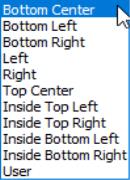
The legend may be positioned anywhere on the graph using the options presented in the section. EViews provides a few common positions in the drop-down menu: , , , , , in addition to the option. All locations are relative to the graph frame.
If is selected, edit fields for the and location are enabled. Note that the origin (0, 0) is the top left corner of the graph frame, and the coordinates are in units of virtual inches (see
“Size & Indents”), regardless of their current display size. It may be easier to position the legend by dragging it to the desired location on the graph instead of providing precise coordinates.
Note that if you place the legend using the option, the relative position of the legend may change if you change the graph frame size. This does not include changing its size on the screen, but may occur if its size in virtual inches is changed via the section of the options.
Legend Font
Click the button to open the dialog and modify the text font and color.
Legend Text
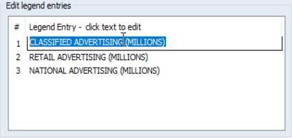
To modify text shown in the legend, use the section of the page. Simply click on the text you wish to modify in the second column of the listbox, and change the legend text in the edit field.
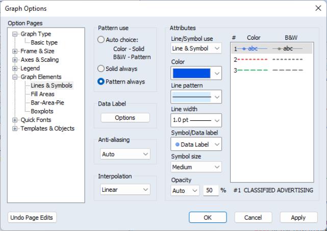
Graph Elements
The options group controls the characteristics of the data elements that you are drawing. This group is divided into sections based on the type of graph element to be: Lines & Symbols, Fill Areas, Bar-Area-Pie, and Boxplots.
Lines and Symbols
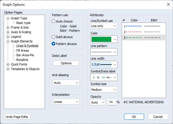
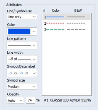
For many graph types, the section under the group permits you to display your graph using lines only, lines and symbols, or symbols alone. In addition, you may specify various line and symbol attributes (color, line pattern, line width, symbol type and size).
To change the settings for your graph, click on the section under the group to show the line attributes. In the section you will see a list of the graph elements that you may change. Click on an element in the right-hand side of the dialog to access its settings, then use the dropdown menus to change its characteristics.
The use dropdown determines the combination of lines and symbols used to display the selected element. You should change the dropdown to l to display both lines and symbols, or to suppress the lines. The corresponding , , , , and dropdowns control the characteristics of the selected element. Note that the settings will sometimes have no effect on the graph (e.g., symbol choice if you are only displaying lines; line pattern if you are only displaying solid lines).
For the most part, the settings are self-explanatory; simply change the symbol and line use, size, and color of a graph element and the preview region will change to reflect your choices. Click on or to apply your selections.
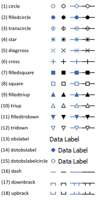
There are three choices that deserve explicit mention. The three entries in the dropdown specify that the symbol should use the observation label from the workfile (the first entry uses the observation label itself; the latter choices also includes a small closed or open circle with an attached text label). In some cases, these labels will be the dates, in other cases they will be integer values (1, 2, 3, ...), and in others, they will be text labels corresponding to the observations in the workfile. You may use this setting to display identifiers for each point in the observation graph.
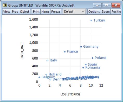
We illustrate this choice by displaying a scatterplot of the Matthews (2000) data on stork breeding pairs and number of births (“Storks.WF1”).
Observation data labels are displayed in the graph so that we may identify the data associated with each observation in the workfile. The graph shows immediately that the upper right-hand corner outlier is Turkey, and that, among others, Polish, Spanish, and Romanian storks have relatively low productivity.
See
“Custom Data Labels” for settings that allow you to customize the data label assigned to each observation.
Once you have selected observation data labels from the dropdown, you can modify their font attributes by clicking on the button in the section on the left-hand side of the dialog. This button brings up a dialog, where you can set the font style, font size, and color of the observation labels.
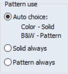
The section of the dialog requires a bit of discussion. By default, this option is set to , meaning that EViews graphs will use different line pattern settings depending on whether you are outputting to a color or a black and white device; lines will be solid when shown on color devices (like your monitor), but will print with a pattern on a black-and-white printer. You may instead select or so that the pattern of lines in the two types of devices always match.
The effect of different choices for this setting are shown in the section of the dialog, which shows what your graph elements will look when output to both types of devices. Our example here uses the setting so that the second and third lines are dashed when displayed on both color and black-and-white devices (for related preview tools, see
“Color & Border”).
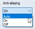
You may notice, at times, that the data line in your line graph does not look perfectly smooth. To allow EViews to use a smoothing algorithm when drawing the line, make sure anti-aliasing is enabled.
In the groupbox, selecting will allow EViews to use anti-aliasing when it determines that doing so will make a visible difference. This choice is dependent primarily on the number of data points. To force anti-aliasing on or off when drawing lines, select or , respectively.
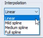
To change the method of connecting points in your graphs, use the options at the bottom of the page. Select from interpolation or a cardinal spline of varying degrees: , , or .
Custom Data Labels
When select one of the three entries in the drop-down control. EViews will display a button in the middle of the first column of options:
Here, we have selected the with a closed circle symbol. By default, when you choose this setting, EViews will display labels for all observations.
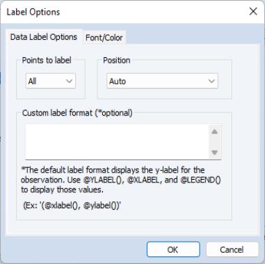
Click on the large button under the entry in the middle of the dialog to display the dialog:
The first tab provides basic labeling options:
• The drop down menu allows you to choose between displaying labels for All, the First, or the Last observation.
• The Position drop down lets you choose to display the label using Auto positioning, or to the Left of observation, Right of observation, Above observation, Below observation, or Center on observation.
• The Label Format edit field allows you to specify the content of the label. You should enter text for the specification in the edit field. The special functions @xlabel() and @ylabel() instruct EViews to use the corresponding X-values and Y-values of the observations as the label; the function @legend() corresponds to the legend value for the data element. All other text will be used in the label as given. You may use the ENTER key format the label in multiple lines.
The second tab of the dialog specifies font family, size, and color settings, as well as special text effects like underlining and strikethrough.
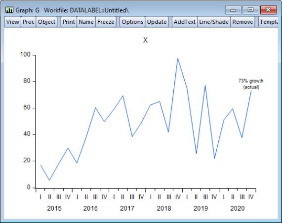
Below, we use the Last observation setting to label the last data point using the Y-value to form a custom data string “% growth (actual)”, by entering
@ylabel()% growth
(actual)
in the edit field. Note that the carriage return in the edit field is used to create a multi-line label.
Importantly, if an observation were to be added to end of the graph, the data label would automatic change to reflect the new value as well as move to proper location above new observation.
Similarly, you may use custom data labels in place of a legend. In this example, the legend was disabled and we activate the custom data label for the last observation, using a
@legend()
specification in the edit field.
Note that a custom data label differs from a custom text label. Data labels are attached to an observation in the graph, while custom text labels may be placed anywhere in the graph. While custom text labels may be placed so that they appear related to specific data values, it takes a bit of work to tie them to the observation data values. In contrast, a custom data label is designed to be linked to the observations so it may easy to attach label text to the first, last, or all of the observations.
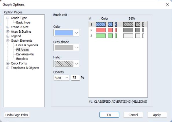
Fill Areas
You may use the section under the group to specify a fill color, gray shade (black-and-white representation of the fill color), or to add hatching to the fill region. The fill colors are used in graphs involving bars, areas, and area bands.
In the section, simply click on one of the entries on the right to select the fill whose characteristics you wish to change (there are two in this example and the first is selected), then use the dropdown menus to alter the color, gray shade, and hatching as desired.
Note that the settings are used for fills that are displayed on a color device; the dropdown controls the fill display when displayed on black-and-white devices. The preview and selection area on the right shows the characteristics of the fill element in both settings (for related preview tools, see
“Color & Border”).
Line and Shade Transparency
You may customize the opacity (transparency) levels of individual lines and shades in a graph. By exercising fine control over the visibility of stacked graph elements, you can uncover previously hidden features of your data.
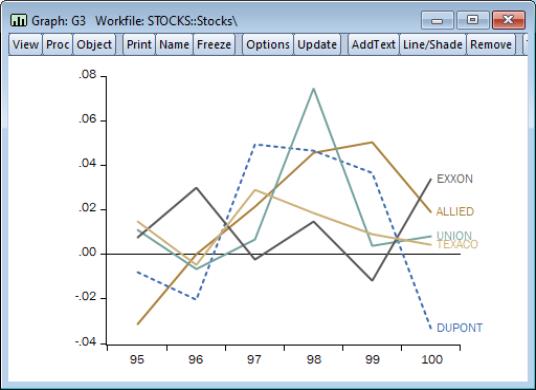
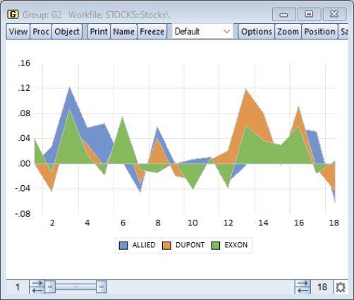
When plotting multiple data for series the graph for data from one series could obscure the data of another. For example, the following area graph shows time series graphs for three series in a group object (ALLIED, DUPONT, and EXXON):
In this graph, data for ALLIED is drawn first, followed by the data for DUPONT, and then by the data for EXXON. Notice that the areas for the later drawn series obscuring the areas for the earlier. Note in particular, that the values of EXXON for observations hide the corresponding values of DUPONT and ALLIED, particularly for observations from 9 to 16.
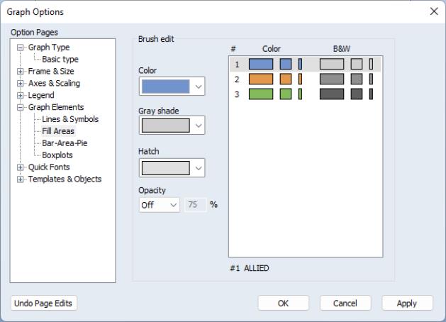
You to adjust the opacity of individual graph elements to improve the visibility of others. To set the opacity for one or more elements, double click on the graph to display the graph options, or select on the Options button on the button bar, then select the node.
Opacity levels may be set for individual Lines and Fill Areas by clicking on an entry in the right hand side of the graph to select a graph element and then entering a number from 0 to 100 in the Opacity % edit field:
You may set levels for more than one element simultaneously by SHIFT or CTRL clicking to select multiple elements, and then applying the desired setting.
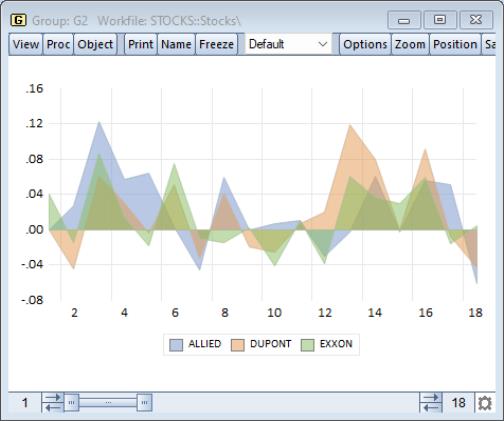
Here is the same graph after setting the of all three of the fill elements to “50”:
Note the additional visible detail in the values of the ALLIED and DUPONT series for observations 9 to 16. In particular, the values of ALLIED, the first drawn series were virtually invisible in the earlier graph, but now show an obvious sawtooth pattern.
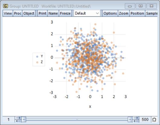
Similarly, turning down the opacity in a dense scatterplot can show additional detail:
Judicious use of transparency settings makes possible the production of graphs that better show overlapping data in a single graph:
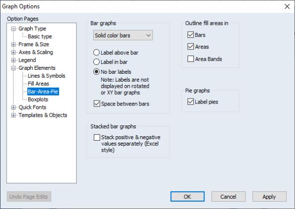
Bar-Area-Pie
There are a few additional options for graphs with filled areas in the section of the group.
The section allows you to add value labels to bars, in addition to shading and a 3D appearance. These options are described in
“Bar”.
You may choose to outline or not outline the fill regions for various fill types using the checkboxes. Here we see that and will be outlined but will not.
Clicking in the group adds or removes observation labels from each pie in a pie graph.