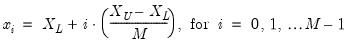
Graph Types
The following is a description of the basic EViews graph types. We divide these graph types into three classes: observation graphs that display the values of the data for each observation; analytical graphs that first summarize the data, then display a graphical view of the summary results; auxiliary graphs, which are not conventional graph types, per se, but which summarize the raw data and display the results along with an observation graph of the original data.
The discussion for each type is limited to a basic overview of each graph type and does not discuss many of the ways in which the graphs may be customized (
e.g., adding histograms to the axes of line graphs or scatterplots;), nor does it describe the many ways in which the graphs are displayed when using multiple series or categorizations (
e.g., stacking; see
“Basic Customization”).
Observation Graphs
Observation graphs display the values of the data for each observation in the series or group. Some observation graphs are used for displaying the data in a single series (Line & Symbol, Area, Bar, Spike, Dot Plot, Seasonal Graphs), while others combine data from multiple series into a graph (Area Band, Mixed, Error Bar, High-Low(-Open-Close), Scatter, Bubble, XY Line, XY Bar, XY Area, Pie).
Line & Symbol
The line and symbol plot is a simple plot of the data in the series against observation identifiers. The plot shows data values as symbols, lines, or both symbols and lines.
To display a line and symbol plot for a single series or for each series in a group, select from the series or group menu to bring up the main dialog, which will automatically open to the page. Then choose in the listbox.
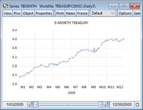
By default, EViews will display the data in the series using a line. To illustrate, we use the workfile “Treasury2005c.WF1” containing data on 2005 daily market yields for U.S. Treasury securities at constant maturities. The default line graph for the 3-month maturity series TB03MTH is depicted. If you look closely, you may be able to see gaps corresponding to holidays.
You may display your graph symbols alone, or using lines and symbols by clicking the section in the option group, and changing the desired attributes (
“Lines and Symbols”). There are other settings for controlling color, line pattern, line width, symbol type, and symbol size that you may modify.
Area
Area graphs are observation graphs of a single series in which the data for each observation in the series is plotted against the workfile indicators. Successive observations are connected by a line, with the area between the origin and the line filled in.
To display an area graph of a single series or each series in a group, you should select from the series or group menu to display the dialog, and then select in the listbox.
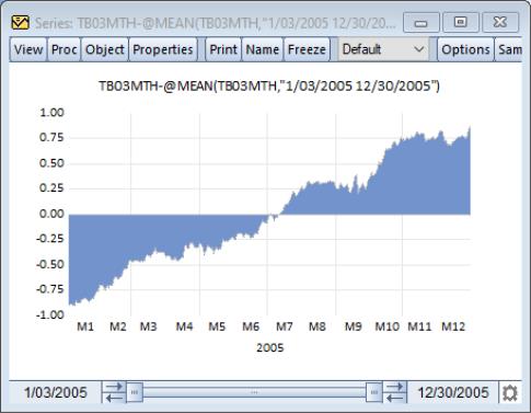
Our illustration depicts the area graph of the deviations of the 3-month Treasury bill series TB03MTH (“Treasury2005c.WF1”) around the mean. Note that positive and negative regions use the same fill color, and that we have connected adjacent non-missing observations by checking the box labeled .
Bar
The bar graph uses a bar to represent the value of each observation in a single series.
Bar graphs may be displayed for a single series or each series in a group by selecting from the series or group menu, and clicking in the listbox.
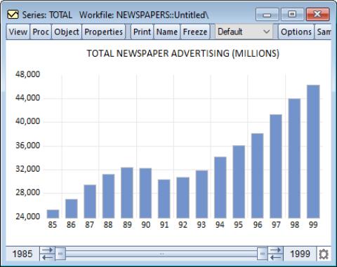
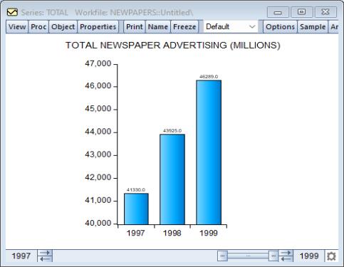
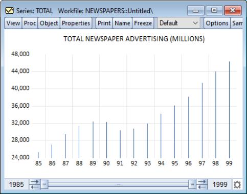
Our illustration shows a bar graph for the series TOTAL (from the workfile “Newspapers.WF1”) containing annual data on total advertising expenditures for the years 1985 to 1999.
Bar graphs are effective for displaying information for relatively small numbers of observations; for large numbers of observations, bar graphs are indistinguishable from area graphs since there is no space between the bars for successive observations.
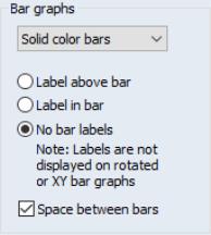
You may add numeric value labels to your bars by double clicking on the bar to display the graph dialog, selecting the section in the option group, and select either , or in the section of the dialog page. EViews will add a label showing the height of the bar, provided that there is enough space to display the label.
You may use the drop-down menu to apply fade effects to your bars. By default, EViews displays the , but you may instead choose to display , , . The latter two entries fade the bars from light to dark, with the fade finishing at the zero axis. Note that at press time, fades are not supported when exporting graphs to PostScript.
The checkbox will do exactly as the option suggests. Alternately, EViews will simply stack sequential elements, even if negative values are encountered.
Moreover, while we discourage you from doing so as bar graphs are traditionally separated, you may also use the page to remove the spacing and/or the outlines from the bars.
Here, we see the bar graph for the TOTAL newspaper advertising expenditures for the years 1997 to 1999, with value labels placed above the bar, and 3D rounded bars. It is worth pointing out that we restrict the sample to the three years, as the labels are not large enough to be visible when displaying lots of bars.
The section in the option group may be also used to change the basic characteristics of the fill area (color, gray shading, hatching,
etc.). See
“Fill Areas” for details.
Area Band
The area band graph is used to display the band formed by pairs of series, filling in the area between the two. While they may be used in a number of settings, band graphs are most often used to display forecast bands or error bands around forecasts.
You may display an area band graph for any group object containing two or more series. Select from the group menu, and then choose in the listbox.
EViews will construct bands from successive pairs of series in the group. If there is an odd number of series in the group, the final series will, be ignored. If you wish to display both area bands and lines in the same graph, you may use the mixed graph type (
“Mixed”).
The dialog under the group may be used to modify the characteristics of the lines and shades in your graph.
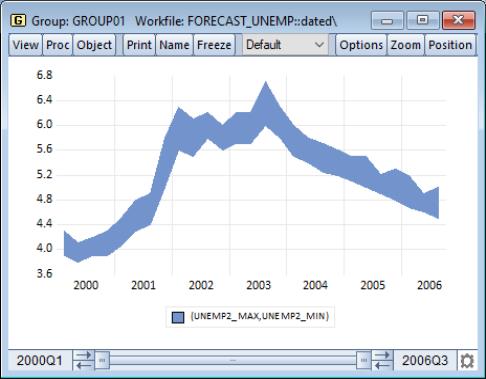
Our example of the area band graph uses data from the Federal Reserve Bank of Philadelphia’s Survey of Professional Forecasters (“Forecast_unemp.WF1”). UNEMP_MAX and UNEMP_MIN contain the high and low one-quarter ahead forecasts of the unemployment rate for each period in the workfile; UNEMP_MEAN contains the mean values over the individual forecasts. To construct this graph, we create a group GROUP01 containing (in order), the series UNEMP_MAX, UNEMP_MIN, and UNEMP_MEAN. Note that reversing the order of the first two series does not change the appearance of the graph.
Spike
The spike plot uses a bar to represent the value of each observation in a single series. Spike plots are essentially bar plots with very thin bars. They are useful for displaying data with moderate numbers of observations; settings where a bar graph is indistinguishable from an area graph.
To display a spike plot for a single series or for each series in a group, select from the series or group menu, and then choose in the listbox.
Our illustration shows a spike graph for the annual total newspaper advertising expenditure data in the series TOTAL in “Newspapers.WF1”. It may be directly compared with the bar graph depiction of the same data (see
“Bar”).
Note that for large numbers of observations, the spike graph is also indistinguishable from an area graph.
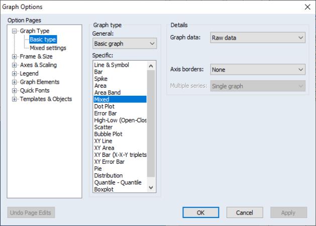
Mixed
This graph type combines line, bar, spike, area, or area band graphs. You may, for example, use the mixed graph to display multiple series in single graph, with the first series shown as a bar, spike, or area graph, or with the first two series displayed as an area band graph, with the remaining series depicted using lines.
To display a mixed plot, you must have with a group object containing two or more series. Select from the group menu, and then choose in the listbox.
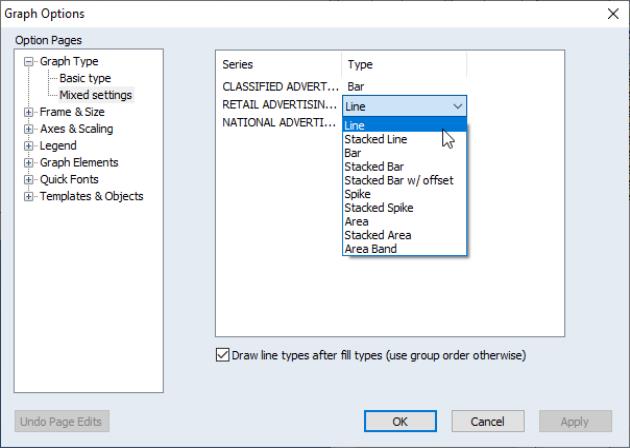
When you select , the left-hand side tree adds an additional page under for . You will use this node to specify the types of graphs you wish to mix. When you click on this node, the right-hand side of the dialog changes to display the new settings:
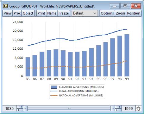
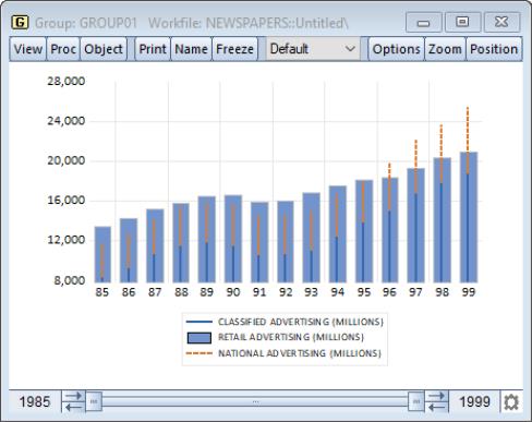
By default, the first series will be plotted as a bar and remaining series will be plotted as lines. Our illustration uses above data from our newspaper advertising example (“Newspapers.WF1”). The data in GROUP01 are displayed as a graph, with the first series dropdown on the right-side of the dialog set to and the remainder to .
You may use the dropdown menus to select different types for each series. If there is a type such as that requires more than one series, EViews will construct the graph using the series defined by a pair of series. Note that the pairs need not be contiguous.
In addition, for legibility, EViews will draw all of the line types after the fill types, but you may override this behavior using the checkbox.
This graph uses custom selected types to displays the first series (Classified Advertising) as a stacked spike, the second series (Retail Advertising) as a bar, and the third series (National Advertising) as a stacked spike. We see that until the later years in the sample, retail advertising exceeded the sum of the classified and national advertising.
Dot Plot
The dot plot is a symbol only version of the line and symbol graph (
“Line & Symbol”) that uses circles to represent the value of each observation. It is equivalent to the plot with the lines replaced by circles, and with a small amount of indenting to approve appearance.
Dot plots may be displayed for a single series or each series in a group by selecting from the series or group menu, and clicking in the listbox.
Symbol options may be accessed using the dialog under the group.
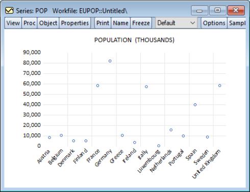
Dot plots are often used with cross-section data. For example, using the series POP in the workfile “EUpop.WF1”, we may produce a dot plot of the 1995 population of each of the 15 European Union members (as of 1995). With a bit of effort we can see that Germany is the clear population outlier.
Dot plots are sometimes rotated so that the observations are on the vertical axis, often with horizontal gridlines. EViews provides easy to use tools for performing these and other modifications to improve the appearance of this graph (
“Orientation” and
“Grid Lines”).
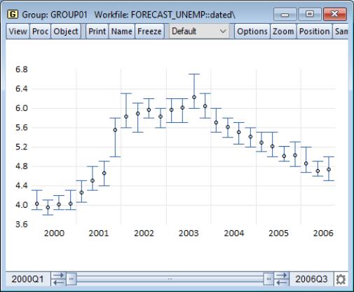
Error Bar
The error bar graph is an observation graph designed for displaying data with standard error bands. As with the related area band graph, error bars are most often used to display forecast intervals or error bands.
The graph features a vertical error bar connecting the values for the first and second series. If the first series value is below the second series value, the bar will have outside half-lines. The optional third series is plotted as a symbol.
You may display an error bar graph for any group object containing two or more series; the error bar will use data for, at most, the first three series. To display an error bar graph, from the group menu, and then choose in the listbox.
Our illustration shows an error graph for the forecasting data in the group GROUP01 in “Forecast_unemp.WF1”. It may be directly compared with the area band graph of the same data (
“Area Band”).
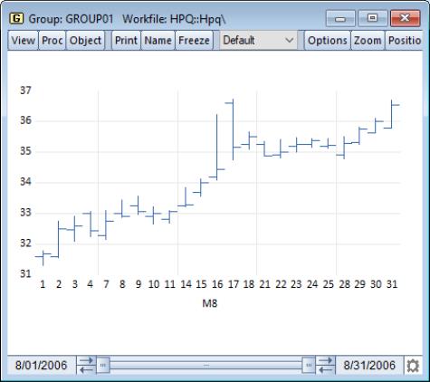
High-Low (Open-Close)
The High-Low (Open-Close) is an observation graph type commonly used to display daily financial data. As the name suggests, this chart is commonly used to plot the daily high, low, opening and closing values of asset prices.
The graph displays data for two to four series. Data from the first two series (the high-low values) will be connected as a vertical line. If provided, the third series (the open value) is drawn as a left horizontal half-line, and the fourth series (the close value) is drawn as a right horizontal half-line.
You may display a high-low graph for any group object containing two or more series. To display an high-low graph, from the group menu, and then choose in the listbox. Data for up to four series will be used in forming the graph.
We illustrate this graph type using daily stock price data for Hewlett-Packard (ticker HPQ) for the month of August, 2006 (“HPQ.WF1”). We display the graph for data in the group GROUP01 containing the series HIGH, LOW, OPEN, and CLOSE.
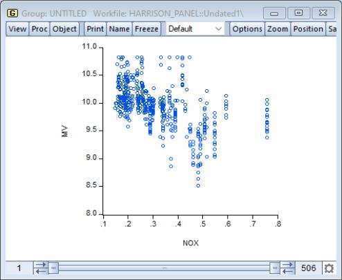
Scatter
A scatterplot is an observation graph of two series in which the values of the second series are plotted against the values of the first series using symbols. Scatterplots allow you to examine visually the relationship between the two variables.
We may display a scatterplot of a group containing two or more series by selecting from the main menu, and then selecting in the listbox.
Our illustration uses data from the Harrison and Rubinfeld (1978) study of hedonic pricing (“Harrison_Panel.WF1”). The data consist of 506 census tract observations on 92 towns in the Boston.
We focus on the variables NOX, representing the average annual average nitrogen oxide concentration in parts per hundred million, and MV, representing the log of the median value of owner occupied houses (MV). We form the group SCATTER containing NOX and MV, with NOX the first series in the group since we wish to plot it on the horizontal axis. The scatter shows some evidence of a negative relationship between air pollution and house values.
Note that EViews provides tools for placing a variety of common graphs on top of your scatter (see
“Auxiliary Graph Types”).
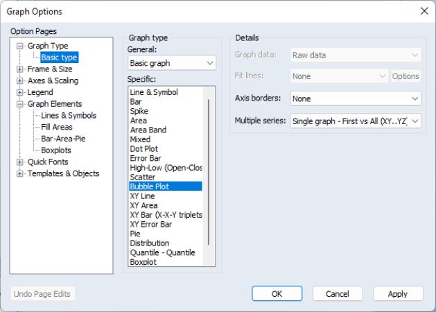
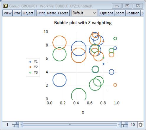
Bubble Plots
A bubble plot is an extension of a scatter plot where the third dimension may be used to specify the size of a data point. Unlike traditional scatter plots, where bubble sizes are fixed, bubble plots allow for variable size bubbles.
To create a bubble plot, select as your :
Bubble plots requires a minimum of three series (a series triplet). When creating a bubble plot from a group object with more than 5 series, you have two ways of defining the triplet: or .
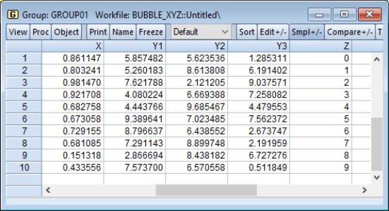
assigns the first series of the group to the horizontal axis, uses the last series in the group to determine the bubble size, and assigns all other series (from the second to the penultimate) to the vertical axis. Suppose, for example, we have a group GROUP01 consisting of the series X, Y1, Y2, Y3, and Z (in the workfile “Bubble_xyz.wf1”).
Thus, if we plot this as a bubble plot and select , EViews will produce:
which shows bubbles for X and Y1, X and Y2, X and Y3, where the size of the bubbles is determined by the series Z.
Alternatively, the approach uses successive series triplets in the group to create plots. Within each triplet, the first series of the triplet is assigned to the horizontal axis, the second series is assigned to the vertical axis and the last series of the triplet determines bubble size.
For either method defining multiple triplets, you may choose to have all the triplets appear in one single graph or to create multiple graphs, with a single graph for each data triplet.
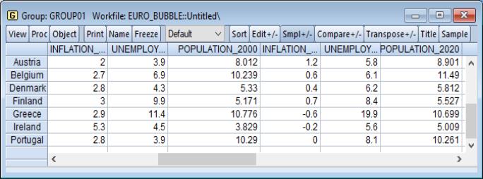
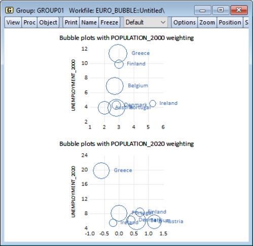
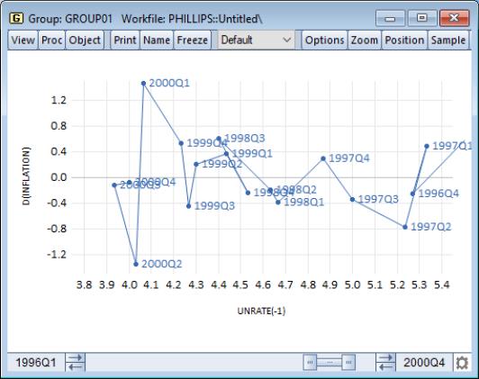
Below we have data on inflation, unemployment, and population from several European countries for 2000 and 2020. These data are grouped in GROUP01, in the workfile “Euro_bubble.wf1”.
We create a Phillips curve bubble plot for each year by selecting as our type:
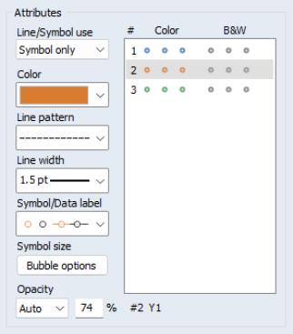
In addition to permitting choice for the method of basic multiple series handling, there are a settings for customizing the computation and display of your bubble plot that are located in a different section of the graph settings dialog. If you go back to the main menu, select the node, and then the entry,
you will see options for changing the color and symbol used in the bubble display (here we have changed it to an orange filled circle).
Further, clicking on the button brings up a dialog with options for how to compute and display the bubbles in your plot:
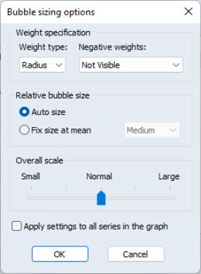
The describes how the weight series values will be interpreted. You may choose between weights that are proportional to the of the bubble, or weights that are proportional to the of the bubble.
The dropdown describes how to handle negative weights, if found. You may choose to ignore those observations (), use the absolute value (), or simply to use the absolute value ().
The settings allow you to override the EViews Auto size method, and choose a size relative to the mean value. Selecting enables a dropdown with various size settings ranging from to .
These custom bubbleplot settings apply to the bubble element that was selected when you clicked on the button. If you wish to apply these settings to all of the bubble elements in a multiple triplet setting, click on .
XY Line
An XY line graph is an observation graph of two series in which the values of the second series are plotted against the values of the first series, with successive points connected by a line.
XY line graphs differ from scatterplots both in the use of lines connecting points and in the default use of a different aspect ratio.
To display a XY line graph we first open a group containing two or more series, then select main menu, and then choose in the listbox.
As with the scatterplot, EViews provides tools for placing a variety of common graphs on top of your XY line graph (see
“Auxiliary Graph Types”).
Our illustration uses data on unemployment rates and inflation for the U.S. from 1996 through 2000. Following the discussion in Stock and Watson (2007), we plot the change in the inflation rate against the previous period’s unemployment rate; to make it easier to see the ordering of the observations, we have turned on observation labeling (
“Lines and Symbols”).
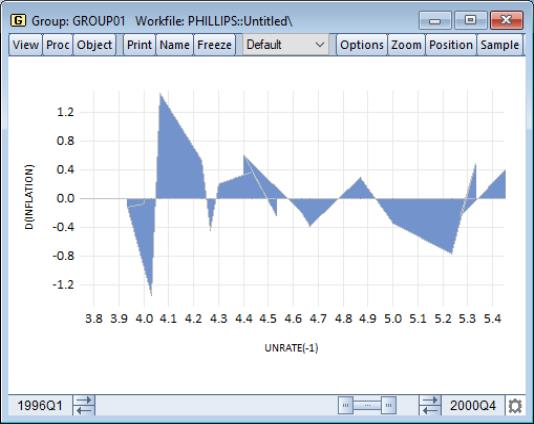
XY Area
The XY area graph is an observation graph of two series in which the values of the second series are plotted against the values of the first series. In contrast with the scatterplot, successive points are connected by a line, and the region between the line and the zero horizontal axis is filled. Alternately, one may view the XY area graph as a filled XY line graph (see
“XY Line”).
To display a XY area graph we first open a group containing two or more series, then select from the main menu, and then choose in the listbox.
We may customize the graph by changing display characteristics using the and dialogs under the dialog group.
Our illustration of the XY area graph uses data on U.S. unemployment as discussed in
“XY Line”. Note that the example graph is not particularly informative as XY area graphs are generally employed when the values of the data in the X series are monotonically increasing. For example, XY area graphs are the underlying graph type that EViews uses to display filled distribution graphs.
XY Bar (X-X-Y triplets)
XY bar graphs display the data in sets of three series as a vertical bar. For a given observation, the values in the first two series define a region along the horizontal axis, while the value in the third series defines the vertical height of the bar. While technically an observation graph since every data observation is plotted, this graph is primarily used to display summary results. For example, the XY bar is the underlying graph type used to display histograms (
“Histogram”).
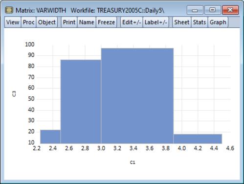
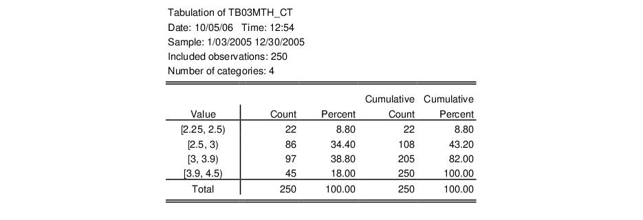
Our illustration uses the XY bar graph to create a variable width histogram for the 3-month Treasury security data from“Treasury2005c.WF1”. We first use to divide the series into categories defined by the intervals [2.25, 2.5), [2.5, 3), [3, 3.9), [3.9, 4.5). The classified series is given by TB03MTH_CT. The frequency view of this series is given by:
Next, we use the data in this table to create a matrix. We want to use a matrix instead of a series in the workfile since we want each row to correspond to a bin in the classification. Accordingly, we create a

matrix VARWIDTH where the first column contains the low limit points, the second column contains the high limit points, and the last column contains the number of observations that fall into the interval.
To display the XY bar graph shown in the example illustration, select from the matrix main menu, and then choose in the listbox.
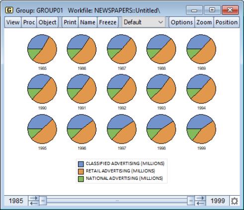
Pie
This graph is an observation graph where each observation is pictured as a pie chart, with the wedges of the pie representing the series value as a percentage of the group total. (If a series has a negative or missing value, the series value will be dropped from the calculation for that observation.)
Pie graphs are available for groups containing two or more series. To display the graph, select from the group menu, and then select in the listbox.
You may choose to label each pie with an observation number. To change the setting from the default value, select the dialog from the group, and select or unselect the option in the section of the page.
Our illustration uses the newspaper advertising revenue data (“Newspapers.WF1”). The three series in GROUP01, CLASSIFIED, RETAIL, and NATIONAL, are the three components of TOTAL advertising revenue. Each pie in the graph shows the relative proportions; retail is the dominant component, but its share has been falling relative to classified.
Seasonal Graphs
Seasonal graphs are a special form of line graph in which you plot separate line graphs for each season in a regular frequency monthly or quarterly workfile.
To display a seasonal graph for a single series or for each series in a group, select from the series or group menu, and then choose in the listbox. Note that if your workfile does not follow a monthly or quarterly regular frequency, will not appear as a specific graph type.
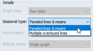
When you select the right-hand side of the page changes to provide a dropdown containing two options for displaying the graph. The first option, , instructs EViews to divide the graph into panels, each of which will contain a time series for a given season. If, for example, we have a monthly workfile, the graph will be divided into 12 panels, the first containing a time series of observations for January, the second containing a time series for February, etc. The second option, , overlays the time series for each season in a single graph, using a common date axis.
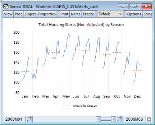
To see the effects of these choices, we consider two examples of seasonal graphs. The EViews workfile “Starts_cust.WF1” contains Census Bureau data on monthly new residential construction in the U.S. (not seasonally adjusted) from January 1959 through August 2006. We will consider the series TOTAL containing data on the total of new privately owned housing starts (in thousands) for the subsample from January 1990 through August 2006.
We first display a seasonal graph for the series TOTAL. Note that the graph area is divided into panels, each containing a time series for a specific month. The graph also contains a set of horizontal lines marking the seasonal means.
It is easy to see the seasonal pattern of housing starts from this graph, with a strong reduction in housing starts during the fall and winter months. The mean of January starts is a little over 120 thousand units, while the mean for May starts is around 180 thousand.
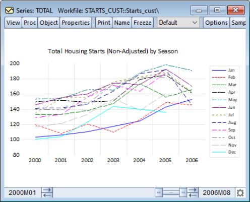
We may contrast this form of the seasonal graph with the form of the seasonal graph. The differences in the individual time series lines provide a different form of visual evidence of seasonal variation in housing starts. The overlayed form of the seasonal graph makes it easier to compare values for a given period.
Here, we see that January values for housing starts are roughly two-thirds of their summer counterparts.
XY Error Bar
The XY error bar graph is an observation graph of a group containing a multiple of four series. The first series contains the x-axis points, the second series is the upper error bar, the third series is the lower error bar, and the fourth series is the data series plotted as a symbol. They are designed for displaying data with standard error bands against a non-observation based series. You may display an XY error bar graph for any group object containing four or more series.
To display an error bar graph, select from the group menu, and then choose in the listbox. Our illustration shows an XY error graph for the (XXX - need example here)...
Analytical Graph Types
Analytical graphs are created by first performing data reduction or statistical analysis on the series or group data and then displaying the results visually. The central feature of these graphs is that they do not show data for each observation, but instead display a summary of the original data.
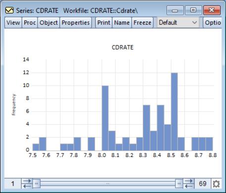
The following is a brief summary of the characteristics of each of these graph types. Unless otherwise specified, the examples use data on three month CD rate data for 69 Long Island banks and thrifts (“CDrate.WF1”). These data are used as an example in Simonoff (1996).
Histogram
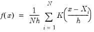
The histogram graph view displays the distribution of your series in bar graph form. The histogram divides the horizontal axis into equal length intervals or bins, and displays a count or fraction of the number of observations that fall into each bin, or an estimate of the probability density function for the bin.
To display a histogram for a single series or for each series in a group, select from the series or group menu, then select from the listbox. The right-hand side of the dialog will change to show options. Select from the drop-down (the default).
(Note that specialized tools also allow you to place histograms along the axes of various graph types.)
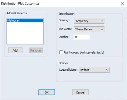
When you select , EViews displays an button that opens the dialog. This dialog allows you to customize your histogram estimate or to add additional distribution graphs. You may, for example, add a fitted theoretical distribution plot or kernel density to the histogram.
Adding additional graph elements may be done using the button in the section of the dialog. As you add elements, they will appear in the listbox on the left. You may select any graph element to display its options on the right-hand side of the page. In this example, there is only the single histogram graph element (which is selected), and the dialog shows the options for that histogram.
First, the dropdown menu lets you choose between showing the count of the number of observations in a bin (), an estimate of the density in the bin (), and the fraction of observations in each bin (). The density estimates are computed by scaling the relative frequency by the bin width so that the area in the bin is equal to the fraction of observations.
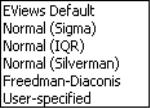
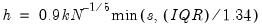
Next, and specify the construction of the bin intervals. By default, EViews tries to create bins that are defined on “nice” numbers (whole numbers and simple fractions). These estimates do not have any particular statistical justification.
Simple data based methods for determining bin size have been proposed by a number of authors (Scott 1979, 1985a; Silverman 1986; Freedman-Diaconis 1981). The supported methods all choose a bin width

that minimizes the integrated mean square error of the approximation (IMSE) using the formula,
:
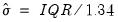
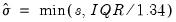
• Normal (Sigma):

,

• Normal (IQR):

,
• Silverman:

,
• Freedman-Diaconis:

,

where

is the sample standard deviation,

is the interquartile range, and

is the number of observations.
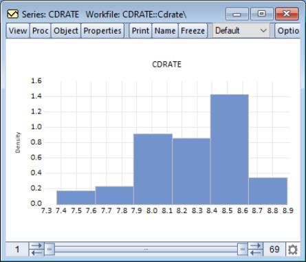
For our example data, displaying a histogram of the CDRATE data using the binwidth method shows a histogram with considerably fewer bins and modified vertical axis scaling. One could argue that the shape of the CDRATE distribution is more apparent in this plot, at the cost of detail on the number of observations in easily described categories.
It is well-known that the appearance of the histogram may be sensitive to the choice of the anchor (see, for example, Simonoff and Udina, 1997). By default, EViews sets the anchor position for bins to 0, but this may be changed by entering a value in the edit box.
The checkbox controls how observations that equal a bin endpoint are handled. If you select this option, observations equal to the right-endpoint of a bin will be classified as being in the bin, while observations equal to the left-endpoint will be placed in the previous bin.
By default, EViews provides the minimum legend information sufficient to identify the graph elements. In some instances, this means that no legend is provided; in other cases, the legends may be rather terse. The dropdown menu allows you to override this setting; you may elect to display a short legend (), to display detailed information (), or to suppress all legend information ().
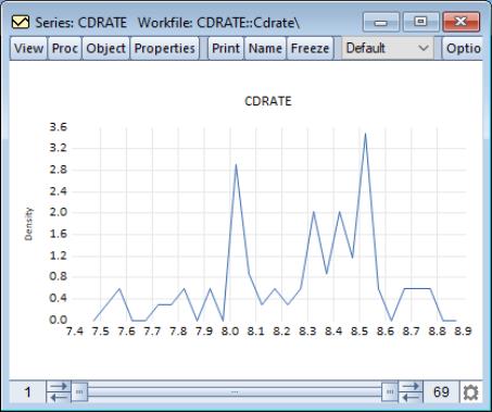
Histogram Polygon
Scott (1985a) shows that the histogram polygon (frequency polygon), which is constructed by connecting the mid-bin values of a histogram with straight lines, is superior to the histogram for estimating the unknown probability density function.
To display a histogram polygon for a single series or for each series in a group, select from the series or group menu, then select from the listbox. Then choose from the options on the right-hand side.
We use the default settings to display the frequency polygon for the three-month CD rate data. The EViews defaults, which were designed to generate easy to interpret histogram intervals, undersmooth the data.
You may control the computation of the histogram polygon by clicking on the button, and filling out the resulting dialog. In addition to all of the options described in
“Histogram”, you may instruct EViews to display the fill the area under the polygon by clicking on the checkbox.
Note that the data based methods for determining bin size differ from those for the frequency polygon. The bandwidth is chosen as in the frequency polygon with

for the , , and methods, and

for . The constant factor in the Freedman-Diaconis is a crude adjustment that takes the histogram value for

and scales it by the ratio of the normal scaling factors for the frequency polygon and the histogram (

).
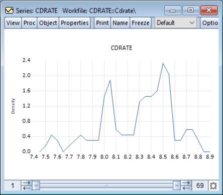
Histogram Edge Polygon
Jones, et al. (1998) propose a modification of the frequency polygon that joins the bin right-edges by straight lines. This modification generates a smoothed histogram that improves on the properties of the frequency polygon.
To display a edge polygon, select from the series or group menu, then select from the listbox. Then choose from the drop-down to the right.
The default edge frequency graph for the CD rate data is displayed here. The EViews defaults, which were designed to generate easy to interpret histogram intervals, appear to undersmooth the data.
You may control the computation of the histogram polygon by clicking on the button, and filling out the resulting dialog. All of the options are described in
“Histogram Polygon”.
Note that the data based methods for determining bin size generate different bin widths than those for the frequency polygon. The bandwidth is chosen as in the histogram and frequency polygon with

for the , , and methods, and

for .
Average Shifted Histogram
The average shifted histogram (ASH) is formed by computing several histograms with a given bin width but different bin anchors, and averaging these histograms (Scott, 1985b). By averaging over shifted histograms, the ASH minimizes the impact of bin anchor on the appearance of the histogram.
Scott (1985b) notes that the ASH retains the computational simplicity of the histogram, but approaches the statistical efficiency of a kernel density estimator. EViews computes the frequency polygon version of the ASH, formed by connecting midpoints of the ASH using straight lines.
To compute an ASH, select from the series or group menu, then select from the listbox. Then choose from the drop-down to the right.
The default ASH for the Long Island CD rate data is displayed above. The EViews defaults, which were designed to generate easy to interpret histogram intervals, undersmooth the data.
When you select , EViews displays an button that opens the dialog allowing you to customize your ASH or to add additional distribution graphs (see
“Histogram” for a discussion of the latter topic).
Almost all of the settings on the right-hand side of the dialog are familiar from our discussion of histograms. The only new setting is the edit box for the . This setting controls the number of histograms over which we average. By default, EViews will compute 25 shifted histograms.
Kernel Density
The kernel density graph displays a kernel density estimate of the distribution of a single series. Heuristically, the kernel density estimator is an adjusted histogram in which the “boxes’ the histogram are replaced by “bumps” that are smooth (Silverman, 1986). Smoothing is done by putting less weight on observations that are further from the point being evaluated. Specifically, the kernel density estimate of a series

at a point

is estimated by:
 | (14.1) |
where

is the number of observations,

is the bandwidth (or smoothing parameter) and

is a kernel weighting function that integrates to one.
To compute and display a kernel density estimate for a single series or for each series in a group, select from the series or group menu, then choose in the listbox. The right-hand side of the dialog page will change to provide a dropdown menu prompting you to choose a distribution graph. You should select .
(Note also that specialized tools allow you to place kernel density plots along the axes of various graph types.)
The default kernel density estimate for the CD rate data (see
“Histogram”) is depicted above.
When you select , EViews displays an button that opens the dialog. This dialog allows you to customize your kernel density estimate, or to add additional distribution graphs. You may, for example, choose a different kernel function, or a different bandwidth, or you may add a histogram or fitted theoretical distribution plot to the graph.
Adding additional graph elements may be done using the button in the section of the dialog.
The section of the dialog allows you to specify your kernel function and bandwidth selection:
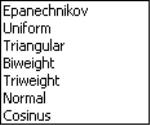
• Kernel. The kernel function is a weighting function that determines the shape of the bumps. EViews provides the following options for the kernel function

:
Epanechnikov (default) | |
Triangular | |
Uniform (Rectangular) | |
Normal (Gaussian) | |
Biweight (Quartic) | |
Triweight | |
Cosinus | |
where

is the argument of the kernel function and

is the indicator function that takes a value of one if its argument is true, and zero otherwise.
• Bandwidth. The bandwidth

controls the smoothness of the density estimate; the larger the bandwidth, the smoother the estimate. Bandwidth selection is of crucial importance in density estimation (Silverman, 1986), and various methods have been suggested in the literature. The
Silverman option (default) uses a data-based automatic bandwidth:
 | (14.2) |
where

is the number of observations,

is the standard deviation, and

is the interquartile range of the series (Silverman 1986, equation 3.31). The factor

is a canonical bandwidth-transformation that differs across kernel functions (Marron and Nolan 1989; Härdle 1991). The canonical bandwidth-transformation adjusts the bandwidth so that the automatic density estimates have roughly the same amount of smoothness across various kernel functions.
To specify a bandwidth of your choice, click on the User Specified option and type a nonnegative number for the bandwidth in the corresponding edit box. Although there is no general rule for the appropriate choice of the bandwidth, Silverman (1986, section 3.4) makes a case for undersmoothing by choosing a somewhat small bandwidth, since it is easier for the eye to smooth than it is to unsmooth.
The
Bracket Bandwidth option allows you to investigate the sensitivity of your estimates to variations in the bandwidth. If you choose to bracket the bandwidth, EViews plots three density estimates using bandwidths

,

, and

.
The remaining options control the method used to compute the kernel estimates, the legend settings, and whether to fill the area under the estimate:
• Number of Points. You must specify the number of points

at which you will evaluate the density function. The default is

points. Suppose the minimum and maximum value to be considered are given by

and

, respectively. Then

is evaluated at

equi-spaced points given by:
 | (14.3) |
EViews selects the lower and upper evaluation points by extending the minimum and maximum values of the data by two (for the normal kernel) or one (for all other kernels) bandwidth units.
• Method. By default, EViews utilizes the Linear Binning approximation algorithm of Fan and Marron (1994) to limit the number of evaluations required in computing the density estimates. For large samples, the computational savings are substantial.
The
Exact option evaluates the density function using all of the data points for each

,
for each

. The number of kernel evaluations is therefore of order

, which, for large samples, may be quite time-consuming.
Unless there is a strong reason to compute the exact density estimate or unless your sample is very small, we recommend that you use the binning algorithm.
• . This dropdown menu controls the information placed in the legend for the graph. By default, EViews uses a minimalist approach to legend labeling; information sufficient to identify the estimate is provided. In some cases, as with the kernel density of a single series, this implies that no legend is provided. You may elect instead to always display a short legend (), to display detailed kernel choice and bandwidth information (), or you may elect to suppress all legend information ().
• . Select this option if you wish to draw the kernel density as a filled line graph.
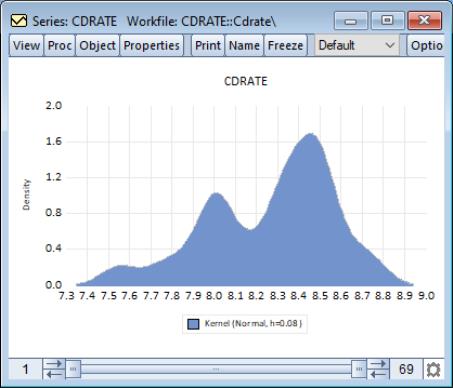
This density estimate for the CD rate data seems to be oversmoothed. Simonoff (1996, chapter 3) uses a Gaussian kernel with bandwidth 0.08. To replicate his results, we fill out the dialog as follows: we select the (Gaussian) kernel, specify a bandwidth of 0.08, select the evaluation method (since there are only 69 observations to evaluate the kernel), select from , and check the checkbox.
This density estimate has about the right degree of smoothing. Interestingly enough, this density has a trimodal shape with modes at the “focal” numbers 7.5, 8.0, and 8.5. Note that the shading highlights the fact that the kernel estimates are computed only from around 7.45 to around 8.85.
Theoretical Distribution
You may plot the density function of a theoretical distribution by selecting from the series or group menu, and choosing in the listbox. The right-hand side of the dialog page will change to provide a dropdown menu prompting you to choose a distribution graph. You should select .
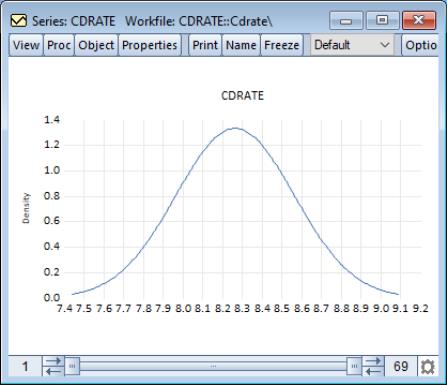
By default, EViews will display the normal density function fit to the data.
The button may be used to display the dialog. As with other distribution graphs, the left-hand side of the dialog may be used to add distribution graphs to the current plot (e.g., combining a histogram and a theoretical distribution).
The right-hand side of the dialog allows you to specify the parametric distribution that you wish to display. Simply select the distribution of interest from the drop-down menu. The small display window will change to show you the parameterization of the specified distribution.
You can specify the values of any known parameters in the edit field or fields. If you leave any field blank, EViews will estimate the corresponding parameter using the data contained in the series.
The provides control over iterative estimation, if relevant. You should not need to use these settings unless the graph indicates failure in the estimation process. Most of the options are self-explanatory. If you select , EViews will take the starting values from the C coefficient vector.
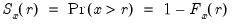
Empirical CDF
The empirical CDF graph displays a plot of the empirical cumulative distribution function (CDF) of the series. The CDF is the probability of observing a value from the series not exceeding a specified value

:
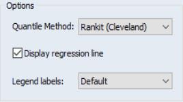
To display the empirical CDF, you should select from the series or group menu, choose in the listbox, and select in the dropdown.
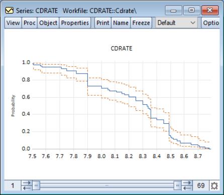
By default, EViews displays the empirical CDF for the data in the series along with approximate 95% confidence intervals. The confidence intervals are based on the Wilson interval methodology (Wilson, 1927; Brown, Cai and Dasgupta, 2001).
Clicking on the button displays a dialog that allows you to specify the method for computing the CDF, to turn on or off the displaying of confidence intervals, to specify the size of the confidence interval, and to control the display of legend entries.
The dropdown controls the method of computing the CDF. Given a total of

observations, the CDF for value

is estimated as:
Rankit (default) | |
Ordinary | |
Van der Waerden | |
Blom | |
Tukey | |
Gumbel | |
See Cleveland (1994) and Hyndman and Fan (1996). By default, EViews uses the Rankit method, but you may use the dropdown to select a different method.
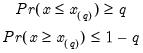
Empirical Survivor
The empirical survivor graph of a series displays an estimate of the probability of observing a value at least as large as some specified value

:
To display the empirical survivor function, select from the series or group menu, choose in the listbox, and select in the dropdown.
By default, EViews displays the estimated survivor function along with a 95% confidence interval (Wilson, 1927; Brown, Cai and Dasgupta, 2001).
See
“Empirical CDF” for additional discussion and a description of the dialog brought up by the button.
Empirical Log Survivor
The empirical log survivor graph for a series displays the log of the probability of observing a value at least as large as some specified value

.
To display the empirical log survivor function, select from the series or group menu, choose in the listbox, and select in the dropdown.
By default, EViews displays the logarithm of the estimated survivor function along with a 95% confidence interval (Wilson, 1927; Brown, Cai and Dasgupta, 2001).
See
“Empirical Survivor” for additional discussion and a description of the dialog brought up by the button.
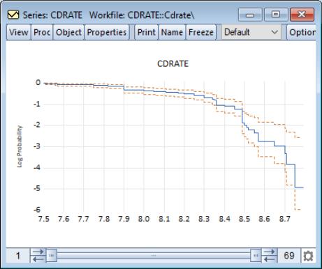
Empirical Quantile
This graph type plots the empirical quantiles of the series against the associated probabilities. The quantile is the inverse function of the CDF; graphically, the quantile can be obtained by flipping the horizontal and vertical axis of the CDF.
For

, the

‑th quantile

of

is a number such that:
The graph plots the values of

against

.
To display the empirical quantile plot, select from the series or group menu, choose in the listbox, and in the dropdown.
By default, EViews displays the empirical quantiles along with approximate 95% confidence intervals obtained by inverting the Wilson confidence intervals for the CDF (Wilson, 1927; Brown, Cai and Dasgupta, 2001).
See
“Empirical Survivor” for a description of the dialog brought up by clicking the button.
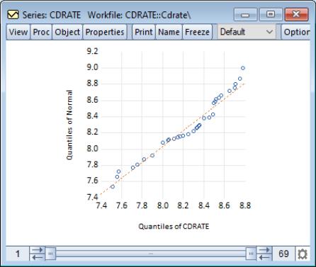
Quantile-Quantile (Theoretical)
Theoretical quantile-quantile plots are used to assess whether the data in a single series follow a specified theoretical distribution; e.g. whether the data are normally distributed (Cleveland, 1994; Chambers, et al. 1983). If the two distributions are the same, the QQ-plot should lie on a straight line. If the QQ-plot does not lie on a straight line, the two distributions differ along some dimension. The pattern of deviation from linearity provides an indication of the nature of the mismatch.
To display the theoretical quantile-quantile plot, select from the series or group menu, choose in the listbox, and select in the dropdown to the right.
By default, EViews displays the QQ-plot comparing the quantiles of the data with the quantiles of a fitted normal distribution.
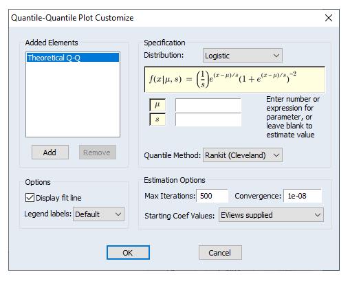
The button may be used to display the dialog. The left-side of this graph may be used to add additional QQ-plots to the current plot, allowing you to compare your data to more than one theoretical distribution.
The right-hand side of the dialog allows you to specify the parametric distribution that you wish to display. See
“Theoretical Distribution” for a discussion of these settings.
In addition, the customize page offers you several methods for computing the empirical quantiles. The options are explained in the section
“Empirical CDF”; the choice should not make much difference unless the sample is very small.
Lastly, the checkbox provides you with the option of plotting a regression line through the quantile values.
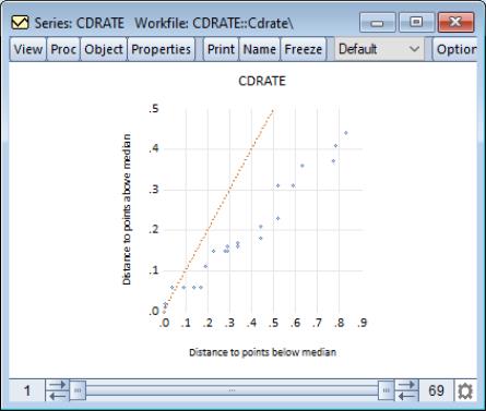
Quantile-Quantile (Symmetry)
An alternative form of the quantile-quantile (QQ)-plot examines the symmetry of the data directly by comparing each quantile value with the corresponding upper-tail quantile value. You may think of this procedure as plotting the distance to points above the median against the distance to the corresponding point below the median (Cleveland, et al. 1983, p. 17). The resulting QQ-symmetry plot has the property that the more symmetric are the data, the closer are the points to the 45 degree line.
To display the quantile-quantile symmetry plot, select from the series or group menu, choose in the listbox, and select in the dropdown to the right.
Our example uses the workfile “CDrate.WF1”, for which we have plotted the symmetry of the series CDRATE. The default QQ-symmetry plot shows that the data is highly asymmetric.
The button may be used to display the dialog. The settings offered in this dialog are limited; you may choose whether to display the 45 degree line and may modify the legend settings.
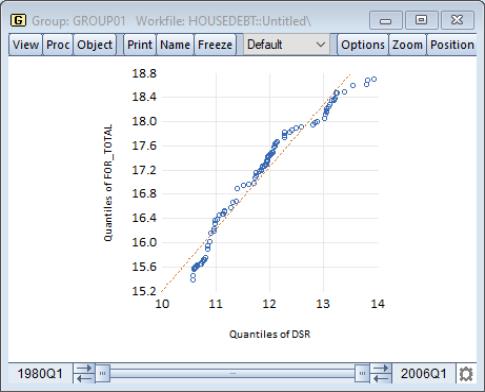
Quantile-Quantile (Empirical)
The empirical quantile-quantile (QQ)-plot plots the quantiles of one series against the quantiles of a second series (Cleveland, 1994; Chambers, et al. 1983). If the distributions of the two series are the same, the QQ-plot should lie on a straight line.
To display the empirical quantile-quantile plot for a group with two or more series, select from the group menu, choose in the listbox, and select in the dropdown.
Our illustration uses the example workfile “Housedebt.WF1”, containing quarterly data on household debt and financial obligations from 1980 to 2006. We show here the default QQ-plot for the debt service ratio series DSR against the financial obligation ratio series FOR_TOTAL.
The settings accessed through the button are limited; you may specify a computation method, choose whether to display the fit line, and modify the legend settings. These settings are discussed in
“Theoretical Distribution” and
“Quantile-Quantile (Theoretical)”.
Note that unlike other distribution graphs, EViews does not allow you to add additional QQ-plots for a given pair of series; rarely will the choice of generate enough of a difference to make such a plot useful.
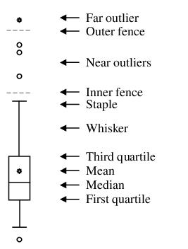
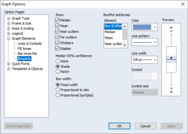
Boxplot
A boxplot, also known as a box and whisker diagram, summarizes the distribution of a set of data by displaying the centering and spread of the data using a few primary elements (McGill, Tukey, and Larsen, 1978).
The box portion of a boxplot represents the first and third quartiles (middle 50 percent of the data). These two quartiles are collectively termed the hinges, and the difference between them represents the interquartile range, or IQR. The median is depicted using a line through the center of the box, while the mean is drawn using a symbol. Note that EViews computes the median for boxplots using the Rankit method.
The inner fences are defined as the first quartile minus 1.5*IQR and the third quartile plus 1.5*IQR. The inner fences are typically not drawn in boxplots, but graphic elements known as whiskers and staples show the values that are outside the first and third quartiles, but within the inner fences. The staple is a line drawn at the last data point within (or equal to) each of the inner fences. Whiskers are lines drawn from each hinge to the corresponding staple.
Data points outside the inner fence are known as outliers. To further characterize outliers, we define the outer fences as the first quartile minus 3.0*IQR and the third quartile plus 3.0*IQR. As with inner fences, outer fences are not typically drawn in boxplots. Data between the inner and outer fences are termed near outliers, and those outside the outer fence are referred to as far outliers. A data point lying on an outer fence is considered a near outlier.
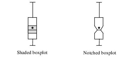
A shaded region or notch may be added to the boxplot to display approximate confidence intervals for the median (under certain restrictive statistical assumptions). The bounds of the shaded or notched area are defined by the median +/- 1.57*IQR/

, where

is the number of observations. Notching or shading is useful in comparing differences in medians; if the notches of two boxes do not overlap, then the medians are, roughly, significantly different at a 95% confidence level. It is worth noting that in some cases, most likely involving small numbers of observations, the notches may be bigger than the boxes.
Boxplots are often drawn so that the widths of the boxes are uniform. Alternatively, the box widths can be varied as a measure of the sample size for each box, with widths drawn proportional to

, or proportional to the square root of

.
To display a boxplot for a single series or for each series in a group, select from the series or group menu, and then choose in the listbox.
(Note that specialized tools allow you to place boxplots along the axes of various graph types.)
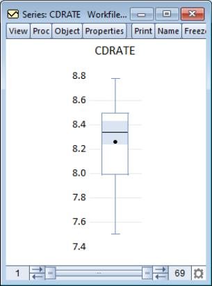
The default boxplot for the three month CD rate data is presented here. Note that since we are displaying the boxplot for a single series, EViews changes the aspect ratio of the graph so that it is taller than it is wide. Typically, boxplots are displayed for multiple series; the aspect ratio will adjust accordingly.
In addition to the option on the main page which allows you to rotate your boxplots, you may specify a number of display options in the dialog under the group.
The left-hand side of the dialog allows you to show or hide specific elements of the boxplot, to control the box widths, and to modify the appearance of the notching and shading.
In the right-hand portion of the dialog, you may customize individual elements of your graph. Simply select an element to customize in the listbox or click on the depiction of a boxplot element in the window, and then modify the , , , and type as desired. Note that each boxplot element is represented by either a line or a symbol; the dialog will show the appropriate choice for the element that you have selected.
The window will change to display the current settings for your graph. You may also click on elements within the window to select them in the listbox, if you find this easier. To revert to the original graph settings, click on .
Auxiliary Graph Types
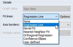
EViews can construct several analytical graphs that are only meant to be added to observation graphs; we term these graphs auxiliary graphs. Strictly speaking, auxiliary XY graphs should not be thought of as a distinct graph type, but rather as a class of modifications that may be applied to an observation plot.
At present, auxiliary graphs may be added on top of scatterplots and XY line graphs. When either or is selected in the listbox, the right-hand side of the graph dialog changes to offer the dropdown menu, where you can select one of the auxiliary types to be added to the graph. If you wish to add additional auxiliary graphs or if you wish to customize the settings of your specified type, you should click on the button to display additional settings.
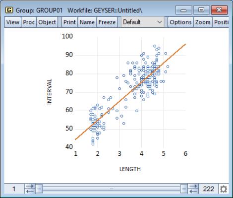
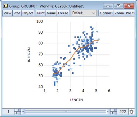
The following is a brief summary of the characteristics of each of these graph types. For illustration purposes, the examples generally use the familiar “Old Faithful Geyser” eruption time data considered by Simonoff (1996) and many others (“Geyser.WF1”). These data provide information on 222 eruption time intervals and previous eruption durations for the Old Faithful Geyser in Yellowstone National Park.
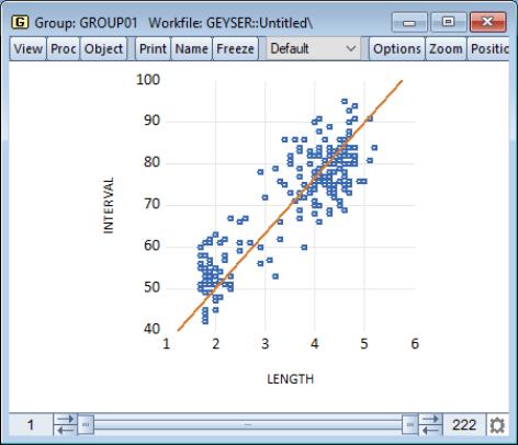
Regression Line
This graph uses data from two series, displaying the fit of a bivariate regression of the second series

on the first series

, and a constant. If desired, you may automatically perform various transformations of your data prior to performing the regression.
Our example uses the geyser data and considers the relationship between previous eruption length, and the interval to the next eruption. We create a group GROUP01 where the first series, LENGTH, represents the duration of the previous eruption, and the second series, INTERVAL, measures the interval between eruptions.
In our illustration, the regression line is drawn on top of the scatterplot of points for the geyser data. Clearly there is a positive relationship between length of eruption and the time until the next eruption.
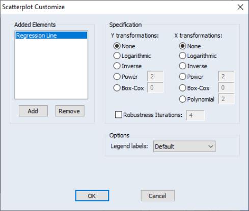
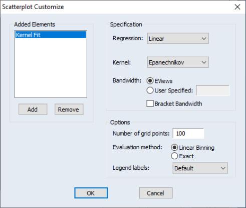
Clicking on the button next to the selection displays the dialog. The left-hand side of the dialog may be used to add additional auxiliary graphs; simply click on the button and select the type of element you wish to add.
The right-hand side of the dialog contains options specific to the selected element. In this case, we see the options for the regression line selection.
First, you may specify transformations of your dependent and independent variables using the radio buttons. The following transformations are available for the bivariate fit:
None | | |
Logarithmic | | |
Inverse | | |
Power | | |
Box-Cox | | |
Polynomial | — | |
where you specify the parameters

and

in the edit field. Note that the Box-Cox transformation with parameter zero is the same as the log transformation.
• If any of the transformed values are not available, EViews returns an error message. For example, if you take logs of negative values, non-integer powers of nonpositive values, or inverses of zeros, EViews will stop processing and issue an error message.
• If you specify a high-order polynomial, EViews may be forced to drop some of the high order terms to avoid collinearity.
Next, you may instruct EViews to perform robustness iterations (Cleveland, 1993). The least squares method is very sensitive to the presence of even a few outlying observations. The Robustness Iterations option carries out a form of weighted least squares where outlying observations are given relatively less weight in estimating the coefficients of the regression.
For any given transformation of the series, the
Robustness Iteration option carries out robust fitting with bisquare weights. Robust fitting estimates the parameters

,

to minimize the weighted sum of squared residuals,
 | (14.4) |
where

and

are the transformed series and the bisquare robustness weights

are given by:
 | (14.5) |
where
is the residual from the previous iteration (the first iteration weights are determined by the OLS residuals), and

is the median of

. Observations with large residuals (outliers) are given small weights when forming the weighted sum of squared residuals.
To choose the number robustness iterations, click on the check box for Robustness Iterations and specify an integer for the number of iterations.
Lastly there is an option controlling the amount of information provided in legends. The EViews default displays a minimum of legend information; this default may be overridden using the dropdown menu. In particular, if you wish to see the coefficients of your fitted line you should select . (Note that coefficient information is not available for some transformations).
Kernel Fit
Using data from two series, this kernel fit displays the local polynomial kernel regression fit of the second series

on the first series

. Extensive discussion may be found in Simonoff (1996), Härdle (1991), Fan and Gijbels (1996).
Both the nearest neighbor fit (
“Nearest Neighbor Fit”), and the kernel regression fit are nonparametric regression methods that fit local polynomials. The two differ in how they define “local” in the choice of bandwidth. The effective bandwidth in nearest neighbor regression varies, adapting to the observed distribution of the regressor. For the kernel fit, the bandwidth is fixed but the local observations are weighted according to a kernel function.
Local polynomial kernel regressions fit

at each value

, by choosing the parameters

to minimize the weighted sum-of-squared residuals:
 | (14.6) |
where

is the number of observations,

is the bandwidth (or smoothing parameter), and

is a kernel function that integrates to one. Note that the minimizing estimates of

will differ for each

.
The default settings compute the local linear fit using the Epanechnikov kernel and an arbitrary, rule of thumb bandwidth rule. For efficient purposes, the kernel fit is evaluated using the linear binning method proposed by Fan and Marron (1994).
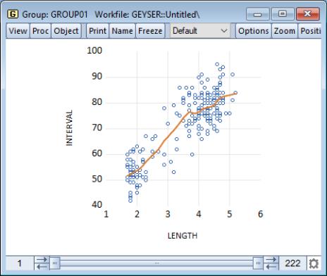
Our example shows the default kernel fit line drawn on top of the geyser scatterplot data. As with the regression line there is a positive relationship between the length of eruption and the time until the next eruption. There does appear to be some flattening of the slope of the relationship for long durations, suggesting that there may be a different model for short and long duration times.
You may click on the button next to the selection to display the dialog. As always, the left-hand side of the graph may be used to add additional auxiliary graphs, while the right-hand side of the dialog provides options for the kernel fit.
You will need to specify the form of the local regression ( constant, , ), the kernel function, the bandwidth, and other options to control the fit procedure.
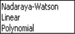
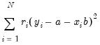
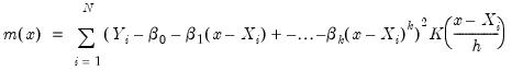
Regression
Here, you will specify the order of the polynomial

to fit at each data point. The option sets

and locally fits a constant at each

. sets

at each

. For higher order polynomials, mark the option and type in an integer in the field box to specify the order of the polynomial.
Kernel
The kernel is the function used to weight the observations in each local regression. Definitions are provided in the discussion of
“Kernel Density”.
Bandwidth
The bandwidth

determines the weights to be applied to observations in each local regression. The larger the

, the smoother the fit. By default,
EViews arbitrarily sets the bandwidth to:
 | (14.7) |
where

is the range of

.
To specify your own bandwidth, mark User Specified and enter a nonnegative number for the bandwidth in the edit box.
The
Bracket Bandwidth option fits three kernel regressions using bandwidths

,

, and

.
For nearest neighbor (variable) bandwidths, see
“Nearest Neighbor Fit”.
Number of grid points
You must specify the number of points

at which to evaluate the local polynomial regression. The default is

points; you can specify any integer in the field. Suppose the range of the series

is

. Then the polynomial is evaluated at

equi-spaced points:
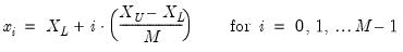 | (14.8) |
Method
Given a number of evaluation points, EViews provides you with two additional computational options: exact computation and linear binning.
The
Linear Binning method (Fan and Marron, 1994) approximates the kernel regression by binning the raw data

fractionally to the two nearest evaluation points, prior to evaluating the kernel estimate. For large data sets, the computational savings may be substantial, with virtually no loss of precision.
The
Exact method performs a regression at each

, using all of the data points

, for

. Since the exact method computes a regression at every grid point, it may be quite time consuming when applied to large samples. In these settings, you may wish to consider the linear binning method.
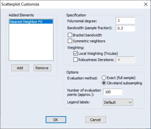
Nearest Neighbor Fit
The nearest neighbor fit displays local polynomial regressions for two series with bandwidth based on nearest neighbors. Briefly, for each data point in a sample, we fit a locally weighted polynomial regression. It is a local regression since we use only the subset of observations which lie in a neighborhood of the point to fit the regression model; it may be weighted so that observations further from the given data point are given less weight.
This class of regressions includes the popular Loess (also known as Lowess) techniques described by Cleveland (1993, 1994). Additional discussion of these techniques may be found in Fan and Gijbels (1996), and in Chambers, Cleveland, Kleiner, Tukey (1983).
The default settings estimate a local linear regression using a bandwidth of 30% of the sample. The estimates use Tricube weighting, and Cleveland subsampling of the data.
Our illustration shows results that are broadly similar to the results for the kernel fit. There is a positive relationship between the length of eruption and the time until the next eruption, with evidence of flattening of the slope of the relationship for long durations.
Clicking on the button next to the Nearest Neighbor Fit dropdown selection displays the dialog. The left-hand side of the dialog may be used to add additional auxiliary graphs, while the right-hand side of the dialog provides options for the nearest neighbor fit.
You will need to specify the form of the local regression, the bandwidth, and other options to control the fit procedure.
Specification
For each point in the sample selected by the hod option, we compute the fitted value by running a local regression using data around that point. The Specification option determines the rules employed in identifying the observations to be included in each local regression, and the functional form used for the regression.
Polynomial degree specifies the degree of polynomial to fit in each local regression.
Bandwidth span determines which observations should be included in the local regressions. You should specify a number

between 0 and 1. The span controls the smoothness of the local fit; a larger fraction

gives a smoother fit. The fraction

instructs EViews to include the

observations nearest to the given point, where

is

% of the total sample size, truncated to an integer.
If you mark the
Bracket bandwidth span option, EViews displays three nearest neighbor fits with spans of

,

, and

.
Note that this standard definition of nearest neighbors implies that the number of points need not be symmetric around the point being evaluated. If desired, you can force symmetry by selecting the Symmetric neighbors option. Symmetric Neighbors forces the local regression to include the same number of observations to the left and to the right of the point being evaluated. This approach violates the definition, but arguably not the spirit, of nearest neighbor regression. Differences between the two approaches will show up where the data are thin (there are relatively few observations in the region).
Weighting
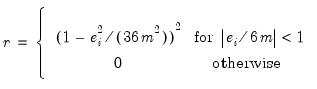
Local Weighting (Tricube) weights the observations of each local regression. The weighted regression minimizes the weighted sum of squared residuals:
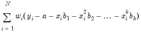 | (14.9) |
The tricube weights

are given by:
 | (14.10) |
where

and

is the

-th smallest such distance. Observations that are relatively far from the point being evaluated get small weights in the sum of squared residuals. If you turn this option off, each local regression will be unweighted with

for all

.
Robustness Iterations iterates the local regressions by adjusting the weights to downweight outlier observations. The initial fit is obtained using weights

, where

is tricube if you choose
Local Weighting and 1 otherwise. The residuals

from the initial fit are used to compute the robustness bisquare weights
 “Regression Line”
. In the second iteration, the local fit is obtained using weights

. We repeat this process for the user specified number of iterations, where at each iteration the robustness weights

are recomputed using the residuals from the last iteration.
Note that LOESS/LOWESS is a special case of nearest neighbor fit, with a polynomial of degree 1, and local tricube weighting. The default EViews options are set to produce LOWESS fits.
Options
You should choose between computing the local regression at each data point in the sample, or using a subsample of data points.
• Exact (full sample) fits a local regression at every data point in the sample.
• Cleveland subsampling performs the local regression at only a subset of points. You should provide the size of the subsample

in the edit box.
The number of points at which the local regressions are computed is approximately equal to

. The actual number of points will depend on the distribution of the explanatory variable.
Since the exact method computes a regression at every data point in the sample, it may be quite time consuming when applied to large samples. For samples with over 100 observations, you may wish to consider subsampling.
The idea behind subsampling is that the local regression computed at two adjacent points should differ by only a small amount. Cleveland subsampling provides an adaptive algorithm for skipping nearby points in such a way that the subsample includes all of the representative values of the regressor.
It is worth emphasizing that at each point in the subsample, EViews uses the entire sample in determining the neighborhood of points. Thus, each regression in the Cleveland subsample corresponds to an equivalent regression in the exact computation. For large data sets, the computational savings are substantial, with very little loss of information.
Orthogonal Regression
The orthogonal regression fit displays the line that minimizes the orthogonal (perpendicular) distances from the

data to the fit line. This graph may be contrasted with the regression fit (
“Regression Line”) which displays the line that minimizes the sum of squared vertical distances from the data to the corresponding fitted

values on the regression line.
Apart from adding other auxiliary graphs, the only option for orthogonal regression is the dropdown menu. If you wish to see the properties of your fitted line you should select . EViews will display the mean of

, the mean of

and the estimated angle parameter.
Confidence Ellipse
The confidence ellipse for a pair of series displays the confidence region around the means (Johnson and Wichern 1992, p. 189).
By default, EViews displays the 95% confidence ellipse around the means, computed using the
F-distribution with

and

degrees-of-freedom.
Our illustration shows the default confidence ellipse around the means of the geyser data. The effect of the positive correlation between the length of eruption and time until next eruption is apparent in the oval shape of the region.
Pressing the button next to the dropdown selection opens a dialog that allows you to specify additional auxiliary graphs to be added, or to modify the ellipse options.
The edit field at the top of the dialog is where you will enter the probabilities for which you wish to compute confidence regions. If you wish to compute more than one, simply provide a space-delimited list of values or put them in a vector and enter the name of the vector.
Next, you may change the method of computing the interval to use the

distribution instead of the
F-distribution.
Lastly, you may use the dropdown menu to change the amount of information provided. If you select , EViews will always display both the probability associated with each ellipse as well as the distribution used to compute values.
User-Defined Fit Lines
You may add custom fit lines to your scatterplot. Within a scatterplot, select from the drop-down on the page, and click the button to display dialog. The left-hand side of the dialog may be used to add additional auxiliary graphs, while the right-hand side of the dialog provides options for the user-defined line.
EViews offers three different ways to specify your line, which you can select via the dropdown menu. The methods available are (setting values for the Y-intercept and slope), (selecting two points of data to draw the line through), or , which allows more complicated line specifications.
For example, let’s start by creating a simple intercept-slope line, with an intercept of “5” and a slope of “0.005”. We also select the option, which results in the following graph:
Similarly, we could specify two points through which to draw the line by selecting as the line type. We use the points (180,6) and (750,9), which results in the following, similar, graph: