Graphing a Series
Up to this point we have examined graph views for series and groups constructed using default settings. We now consider the process of displaying graph views of a single series in a bit more depth.
Our discussion focuses on the selection of a graph type and setting of associated options. We consider the general features of selecting a graph type for the series, not on the particulars associated with each graph type. Details on the individual graph types are provided in
“Graph Types”.
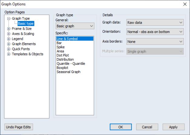
To display the graph view of a single series, you should first select from the series menu to display the dialog.
The dialog has multiple pages that specify various settings for the graph view. The page depicted here is of central importance since it controls the graph you wish to display. The other dialog pages, which control various display characteristics of the graph, will be discussed below (
“Basic Customization”).
Choosing a Type
On the left-hand side of the page, you will see the section where you will specify the type of graph you wish to display.
First, the dropdown menu allows you to switch between displaying a of the data in the series, and displaying a constructed using the data divided into categories defined by factor variables. For now, we will stick to basic graphs; we defer the discussion of categorical graphs until
“Categorical Graphs”.
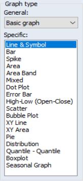
Second, the list box offers a list of the graph types that are available for use with this object. You may select a graph type by clicking on its name. The default graph type is a plot.
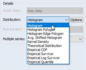
In most cases, these two settings are sufficient to identify the graph type. If, however, you select graph as your specific graph type, the right-hand side of the dialog will offer an option for choosing a specific distribution graph (note that the dropdown menu for has been replaced by one labeled ). The button allows you to customize the selected distribution graph, or to display more than one distribution graph in the frame (see
“Multiple Graph Types”).
Similarly, if you select either or as your specific type, the dialog will change to provide you with additional options. For theoretical quantile-quantile plots, you may use the button to specify a distribution or to add plots using different distributions. For seasonal graphs, there will be a dropdown menu controlling whether to panel or overlay the seasons in the graph.
Details
The right-hand side of the dialog offers various options that EViews collectively labels . The options that are available will change with different choices for the graph type. We have, for example, already mentioned the sub-type settings that are available when you select , , or . We now consider the remaining settings.
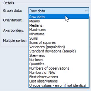
Graph Data
The dropdown specifies the data to be used in observation graphs. By default, EViews displays observation graphs that use , meaning that every observation will be plotted. The dropdown allows you to compute summary statistics (, , etc.) for your data prior to displaying an observation graph. (Note: if we display an observation graph type using summary statistics for the data, the graph is no longer an observation graph since it no longer plots observations in the workfile. Such a graph is, strictly speaking, a summary graph that uses an observation graph type.)
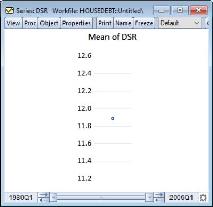
It is worth noting that a summary statistic graph for a single series shows a single data point. For example, we see here the Line & Symbol graph for the mean of the debt service ratio series DSR in our example workfile (“Housedebt.WF1”). Since we are working with a single series, the graph displays data for a single point which EViews displays as a symbol plot.
One will almost always leave this setting at in the basic single series case. As we will see, the option is most relevant when plotting data for multiple series, or when plotting data that have been categorized by some factor.
Orientation
The dropdown allows you to choose whether to display observation graphs with the observations along the horizontal or the vertical axis. By default, EViews displays the graph with the observations along the horizontal axis (), but you may elect to display them on the vertical axis ().
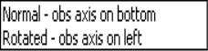
For example, bar graphs are sometimes displayed in rotated form. Using the workfile “EUpop.WF1”, we may display a rotated bar graph of the 1995 population (POP) for each of the 15 European Union members.
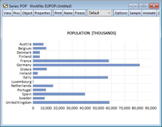
As an aside, it is worth mentioning here that graphs of this form, where observations have no particular ordering (unlike graphs involving time series data) sometimes order the bars by size.
While EViews does not allow you to change the order of data in a series view, you can reorder the observations in a graph object (frozen series view).
While displaying the bar graph view, simply click on the button to create a graph object, then press the right mouse button and select to display the sort dialog. Sorting on the basis of values of POP in ascending order yields the graph depicted on the right. Note that sorting reorders the data in the graph object, not the data in the original series POP.
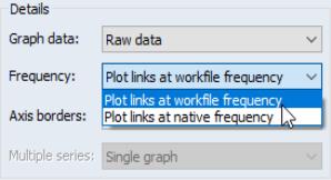
Frequency
When plotting a line graph for a link series (see
“Series Links”), the graph dialog changes to offer you the option of choosing to plot the data at the native frequency (the frequency of the source page), or at the frequency of the current workfile page (the frequency of the destination page).
By default, EViews will plot the data at the native frequency of the series. To plot the frequency converted data, you should select .
Related discussion and examples may be found in
“Mixed Frequency Graphs”.
Note that when plotting links, the dropdown replaces the dropdown. To rotate the graph, you will need to manually assign the series to the bottom axes using the page of the dialog (
“Axis Assignment”).
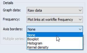
Axis Borders
You may use the dropdown to select a distribution graph to display along the axes of your graphs. For example, you may display a line graph with boxplots or kernel densities along the data (vertical) axis.
By default, no axis graphs are displayed ().
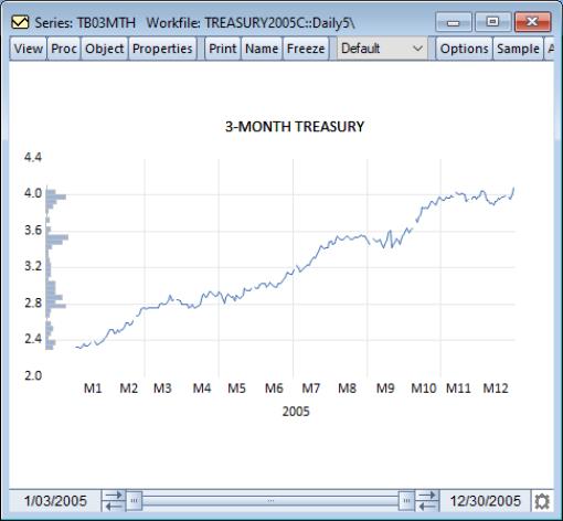
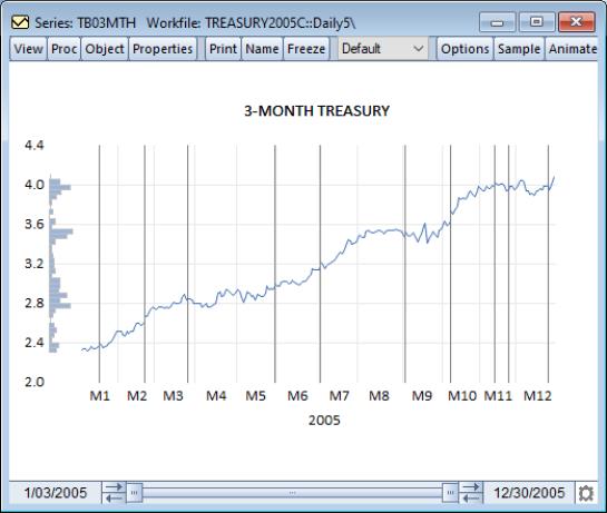
To illustrate, we use the workfile “Treasury2005c.WF1” containing data on 2005 daily market yields for U.S. Treasury securities at constant maturities. We display a line graph for 3-month maturities (TB03MTH) containing a histogram along the data axis.
Note the relationship between the bulges in the distribution and the quarter ends.
Sample Break & NA Handling
By default, an observation graph will leave “spaces” for observations containing missing values. If you look closely at the line graph of TB03MTH above, you may see a few gaps in the line corresponding to days the market was closed.
If there are missing values in your data, the page will change to offer you a choice for how to handle the missing values. You may close the gaps in your graph by checking the box labeled or .
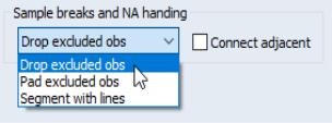
Similarly, if you specify a sample that is non-contiguous, EViews will offer you choices on how to handle the gap in the observation scale.
The default is to drop the excluded observations from the graph scale (), but you may instead choose to pad the graph with the excluded observations (). The final option, , is the same as , but with a vertical line drawn at the seams in the observation scale.
In this latter setting, may be used to connect observations across both the seams and across missing values.
To illustrate, we again consider the TB03MTH series. First, set the workfile sample to exclude missing values for TB03MTH (“smpl if TB03MTH<>NA”), and then select to produce a graph that highlights the location missing observations.
We see that there are 10 internal missing values in the series, with several, not-surprisingly, in the holiday rich fourth quarter of the year. Notice that the line depicting TB03MTH stops at the two sides of the segment; to connect the lines across the segment, you must select .
Panel Options
When plotting observation graphs in workfiles with a panel data structure, the page offers additional options for how to use the panel structure. A section will be displayed containing a dropdown menu that controls the panel portion of the display.
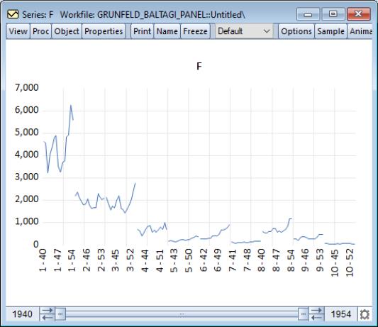
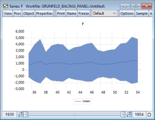
By default, EViews uses the options, which simply stacks the data for each cross- section and plots the data without regard for panel structure. The resulting graph is a observation plot of the entire workfile. For example, a line graph for the series F in the Grunfeld-Baltagi data (“Grunfeld_Baltagi_Panel.WF1”), shows that there is considerable variation across cross-sections, with cross-section 3 in particular having high values:
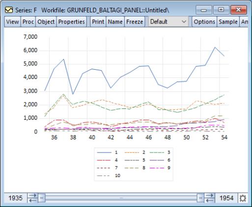
Alternately, you may choose to display a line graph of the data for each cross-section in its own frame (), or in a single frame ().
The combined panel graph for the example panel is given by:
EViews also allows you to plot means plus standard deviation bounds () or medians plus quantiles () computed across cross-sections for every “period”. In the latter two cases, EViews will also prompt you for the number of SDs to use in computing the bounds, and the quantiles to compute, respectively.
The means plus/minus two standard deviations graph for the example data is given by:
Each observation in the time series for the mean represents the mean value of F taken across all cross-sections in the given period. The standard deviation lines are the means plus and minus two standard deviations, where the latter are computed analogously, across cross-sections for the period.
Multiple Graph Types
We have previously alluded to the fact that we may display multiple Distribution plots or multiple theoretical Quantile-Quantile plots in the same graph. It is easy, for example, to display a graph showing both a histogram of your series data and a fitted normal density curve, or to show Quantile-Quantile plots of your series against both a normal and an extreme value distribution.
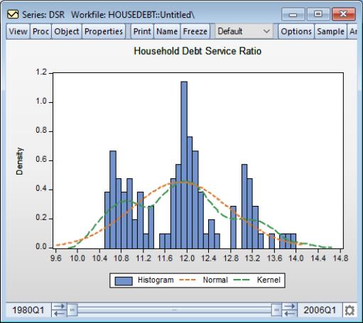
To illustrate, we open the debt service ratio series DSR in the “Housedebt.WF1” workfile. We begin by selecting graph as our type, and as our specific distribution type.
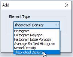
Next, click on the button to display the options page. Click on the button to add an additional distribution graph. EViews displays a new dialog prompting you to select from the list of distribution types that you may add to the histogram. To begin, we select , then click on to add the element.
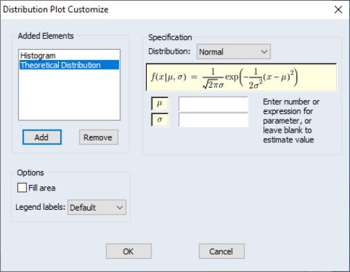
The dialog page changes to reflect your choice. The listbox on the left now shows that we have two different graph elements: the original , and the newly added . You may select an element in the list box to show or modify the options for that element. Here we see the options for the selection.
You may add additional elements by clicking on the button and selecting the desired graph type, or you may remove an element by selecting it in the listbox and pressing the button.
For our example, we press the button again to add a Kernel Density graph to two existing elements.
Returning to the main graph page, you should note that when you have a graph with multiple types, the dropdown on the main page shows that you have a graph (not depicted). Click on to display the specified graph.
EViews displays the fitted normal and kernel density estimates (in red and green, respectively) superimposed over the original histogram. Note that both the kernel density and histograms suggest that there are three distinct groups of observations for the debt service ratio.