Graphing Multiple Series (Groups)
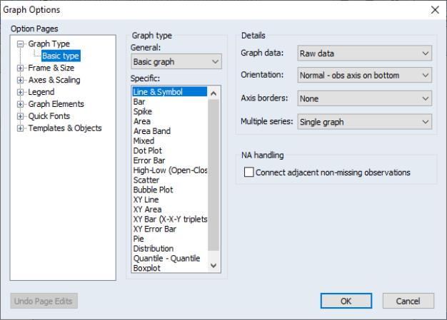
EViews makes it easy to display graphs of the data in multiple series in a group object. Simply open the group object, select and fill out the dialog:
As with the single series dialog, the dialog has multiple pages that specify various settings for the graph view. We again focus exclusively on the page. The other pages, which control various display characteristics of the graph, are described below (
“Basic Customization”).
Choosing a Type
To select a graph type simply click on its name in the type listbox. The options that you will see on this page will depend on the selected graph type. Some of the options (, have already been considered (see
“Details”), so we focus here on the remaining settings. To aid in our discussion we divide entries in the listbox into three classes:
• The first class consists of all of the graphs available in the series graph dialog (Line, Bar, Spike, Distribution, etc.). For this class, EViews will produce a graph of the specified type for each series in the group. Options will control whether to display the graphs in a single frame or in individual (multiple) frames.
• The second class of graphs use the multiple series to produce specialized observation plots of series data (Area Band, Mixed, Error Bar, High-Low (Open-Close), Pie).
• The final class produce pairwise plots of series data against other series data (Scatter, Bubble, XY Line, XY Area, XY Bar). Options will be used to control how to use the different series in the group, and if relevant, whether to display the graph in a single or multiple frames. Note that these graphs are observation plots in the sense that data for each observation are displayed, but unlike other observation graphs we have seen (e.g., line graphs), data are not plotted against workfile observation indicators.
We consider the settings for each of these classes in turn.
Single Series Graphs
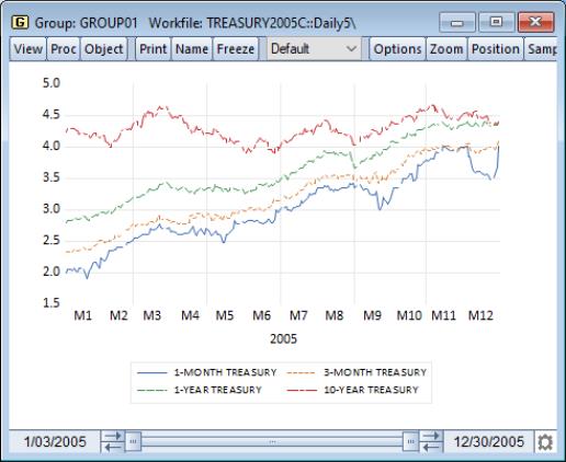
Returning to our Treasury bill workfile (“Treasury2005c.WF1”), we first open the group GROUP01 containing the 1-month, 3-month, 1-year, and 10-year Treasuries, then click on to display the graph options dialog.
Multiple Series
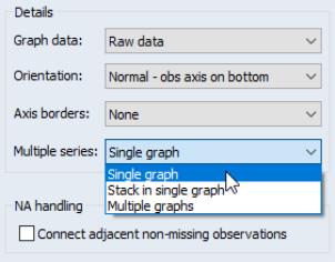
When you select any of the individual series graph types in a group with more than one series, the right-hand side of the dialog changes to reflect your choice. In addition to the , , and settings considered previously there will be a dropdown menu, labeled which controls whether to display: the individual series in a single frame (), the stacked individual series in a single frame (), or the series in individual frames ().
By default, EViews will display all of the series in the group in a single graph frame as depicted here. Each series is given a different color and a legend is provided so that you may distinguish between the various lines.
We see four distinct lines in the graph, each corresponding to one of the series in the group. Displaying the series in the same graph highlights a most notable feature of the Treasury rate data: the narrowing of the spread between yields at different maturities over the course of the year.
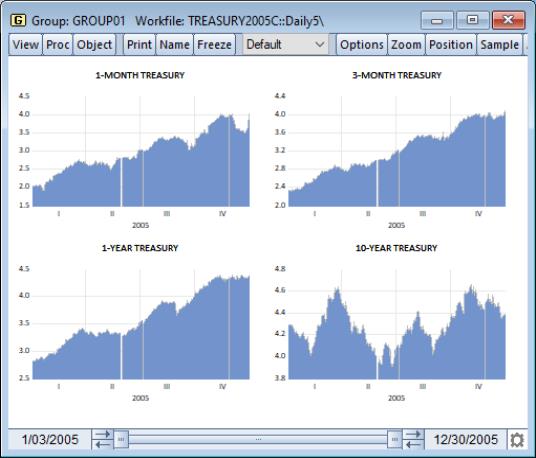
Setting the dropdown to instructs EViews to display each of the series in its own graph, with the individual graphs arranged in a larger graph as shown here for an area graph. We have not selected the setting so there are gaps due to missing values.
Note that in contrast to the setting where each series is plotted on the same scale, each graph is given a different vertical axis scale. This display emphasizes the individual variation in the series, but makes it more difficult to compare across series. Later, we will show how we may control the vertical axes scales (
“Axes & Scaling”).
The final dropdown setting, , allows you to plot data that are sums of the series in the group. This method is available for most, but not all, individual graph types. The first graph element will be the first series plotted in the usual way; the second element will be the sum, for every observation, of the first series and the second. The third element will contain the sum of the first three series, and so forth.
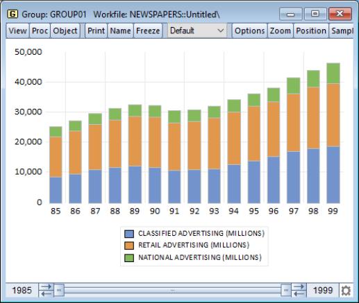
We illustrate the stacked graph using data on newspaper advertising revenue data (“Newspapers.WF1”). The three series in the group object GROUP01 (CLASSIFIED, RETAIL, and NATIONAL), are the three components of TOTAL advertising revenue.
The height of the stacked bar for each observation shows the total amount of newspaper advertising revenue. We see that national advertising is by far the smallest component of advertising revenue and retail is the largest, though classified appears to be growing as a share of total revenue.
Graph Data
Earlier we saw that the dropdown allows you to display summary statistic graphs (, ,
etc.) for your data (
“Graph Data”). For graphs of a single series, displaying summary data may be of limited value since the graph will show a single summary value. For multiple series, the dropdown allows us to display graphs that compare values of the statistics for each of the series in the group.
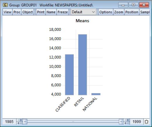
Once again using the newspaper advertising revenue series in group GROUP01, we set the dropdown to and display a bar graph with the multiple series displayed in a single frame. We see that the means of both RETAIL and CLASSIFIED advertising revenue are significantly greater than the average NATIONAL revenue.
Mixed Frequency Graphs
One important application of multiple series graphs involves displaying line graphs of mixed frequency data. You may, for example, have a workfile with two pages, one containing data sampled at a monthly frequency, and the other sampled at a quarterly frequency. EViews allows you to display line graphs of data from both pages in a single graph, with each series plotted at its native frequency.
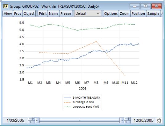
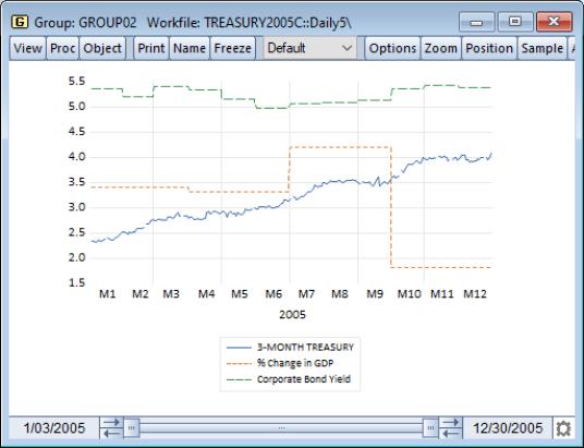
To illustrate, we again use our Treasury bill workfile (“Treasury2005c.WF1”). We work with the group GROUP02 in the “Daily5” page, containing the series TB03MTH, AAA, and GDPCHG. TB03MTH is, as we have already seen, the 3-month T-bill series measured at a 5-day daily frequency.
The other series in the group are link series. (See
“Series Links” for a discussion of links). AAA, which is linked from the workfile page, contains data on Moody's Seasoned Aaa Corporate Bond Yield. GDPCHG, which is linked from the workfile page, measures the (annualized) quarterly percent change in GDP (in chained 2000 dollars). Both links convert the low frequency data to high using the constant-match average frequency conversion method.
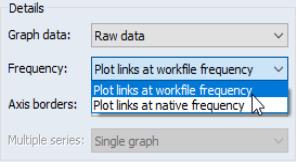
Note that since the two link series are tied to data in other workfile pages, EViews has access to both the native (monthly and quarterly) and the converted (daily 5) frequencies for the AAA and GDPCHG. Accordingly, the main graph dialog for GROUP02, prompts you for whether you wish to plot your links using the native frequency data, or whether you wish to plot links using the workfile frequency (the frequency converted) data.
We first display a line graph of the series in the group using the setting. Since TB03MTH is sampled at the workfile frequency, this graph is a mixed frequency graph, with TB03MTH plotted at a daily-5 frequency, AAA plotted at a monthly frequency, and GDPCHG plotted at a quarterly frequency. To make it easier to see the different frequencies in the plot, we display AAA and GDPCHG using lines and symbols (
“Lines and Symbols”), and we add vertical grid lines (
“Frame”) to the graph.
Note that the GDPCHG line connects the four quarterly values of the series measured at its native frequency. The four points are each centered on the corresponding range of daily-5 dates. Similarly, the 12 monthly values of AAA are connected using line segments, with the individual points centered on the appropriate range of daily-5 values.
We may compare this graph to the same plot using the setting. Here, all three series are plotted at the daily-5 frequency, with the AAA and GDPCHG series using the frequency converted values. Note that the graph simply uses the values that are displayed when you examine the link series in the spreadsheet view.
In contrast to the earlier graph, AAA and GDPCHG are displayed for each daily-5 date. Since the frequency conversion method for both series was to use a constant value, the graphs for AAA and GDPCHG are step functions with steps occurring at the native frequency of the links.
Specialized Graphs
The Area Band, Mixed, Error Bar, High-Low (Open-Close), and Pie graph types use multiple series in the group to form a specialized graph. Each specific type has its own set of options. For additional detail and discussion, see the description of the individual graph type in
“Observation Graphs”.
Pairwise Graphs
The final class of graphs use data for a given observation in pairs, plotting the data for one series against data for another series (Scatter, Bubble, XY Line, XY Area, XY Bar).
For Scatter, XY Line, and XY Area graphs for groups containing exactly two series, there is no ambiguity about how to use the data in the group; there will be a single graph frame with the first series placed along the horizontal axis and the second series along the vertical axis. When there are more than two series, you will be prompted on how to use the multiple series to form data pairs and whether to display the graphs in a single or multiple frames.
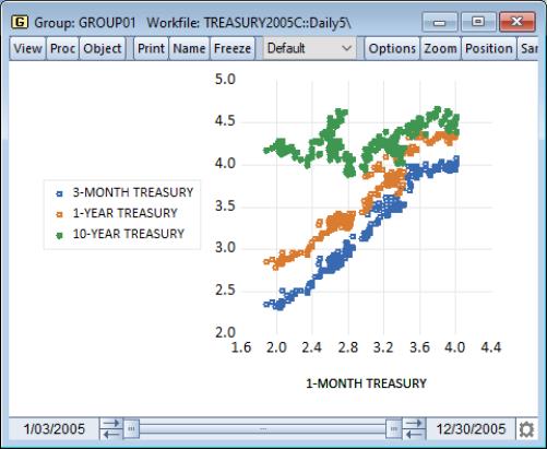
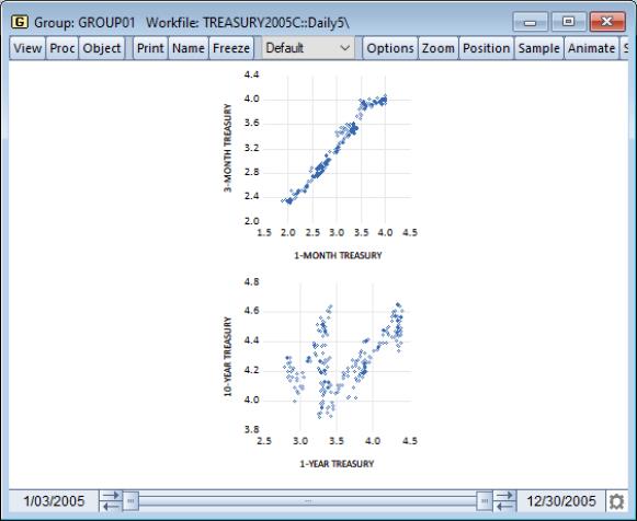
Single graph - First vs. All
This setting forms graph pairs using the first series along the horizontal axis plotted against each of the remaining series along the vertical axis. The graph displays all of the graph pairs in a single frame.
We illustrate using a scatterplot of GROUP01, which contains our Treasury data at different maturities. The first series in the group is the 1-month Treasury rate, which is plotted against the remaining series in the group.
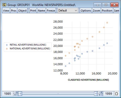
Single graph - Stacked
As the name suggests, this setting plots the first series against the remaining series in stacked form. Thus, the first series is plotted against the second series, against the sum of the second and third series, against the sum of the second through fourth series, and so forth.
We illustrate using our data on newspaper advertising revenue data (“Newspapers.WF1”). For GROUP01, we show the stacked XY graph that plots CLASSIFIED against RETAIL and CLASSIFIED against the sum of RETAIL and NATIONAL.
Single graph - XY pairs
This setting forms pairs by using successive pairs of series in the group. The first series is paired with the second, the third with the fourth, and so on, with the first series in each pair placed on the horizontal axis, and the second series placed on the vertical axis. If the group contains an odd number of series, the last series will be ignored. The graph uses a single frame for all of the graph pairs.
Multiple graphs - First vs. All
Like , this setting plots the first series against the remaining series, but instead places each pair in an individual graph frame.
Multiple graphs - XY pairs
Like , this setting forms pairs by using successive pairs of series in the group, but places each pair in an individual graph frame.
We again illustrate using an XY scatter graph of the group object GROUP01 containing our Treasury data. The first series in the group is the 1-month Treasury rate, which is plotted against the remaining series in the group.
Note that each graph has its own data frame and vertical axis scale. In addition, we may manually set the vertical axes scales (
“Axes & Scaling”).
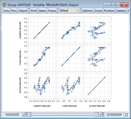
Scatterplot matrix
The setting forms pairs using all possible pairwise combinations for series in the group and constructs a plot using the pair. If there are

series in the group, there will be a total of

plots, each in its own frame.
Note that the frames of the graphs in the scatterplot matrix are locked together so that the individual graphs may not be repositioned within the multiple graph frame.
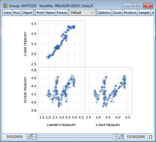
Lower triangular matrix
This setting constructs the same plots as , but displays only the lower triangle elements consisting of the unique pairs of series not including the series against itself. There are a total of

distinct pairwise graphs, each displayed in its own frame.
Note that the frames of the graphs in the lower triangular matrix are locked together so that the individual graphs may not be repositioned within the multiple graph frame.
Fit Lines
EViews provides convenient tools for superimposing auxiliary graphs on top of your Scatter or XY line plot, making it easy to put regression lines, kernel fits, and other types of auxiliary graphs on top of your XY plots.
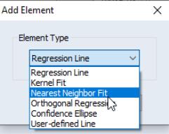
When you select or from the type listbox, the right-hand side of the page changes to offer a option, where you may add various types of fit lines to the graph as outlined in
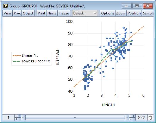
“Auxiliary Graph Types”. You may also use the button to add additional auxiliary graphs. To illustrate, we use the familiar “Old Faithful Geyser” eruption time data considered by Simonoff (1996) and others (“Geyser.WF1”), and add both a regression line and a nearest neighbor fit relating eruption time intervals to previous eruption durations.
First, we open the group GROUP01 and select as our type, then select in the dropdown to add a linear regression line. Next, click on the button to display the page.
Click on the button to add an additional fit line to the existing graph. EViews displays a new dialog prompting you to select from the list of fit lines types that you may add to the scatterplot with regression line. We will select to be added to the existing graph. Click on to accept your choice.
You may elect to add additional elements by clicking on the button, or to remove an element by selecting it in the listbox and clicking on the button.
Returning to the main graph page, we see that the dropdown now reads (not depicted) indicating that we are using multiple graph types.
Click on to accept the graph settings, and EViews displays the scatterplot with both the linear regression fit and the default LOWESS nearest neighbor fit superimposed on the observations. Note that since there are two lines in the graph, EViews provides legend information identifying each of the lines. We see the nearest neighbor fit has a slightly higher slope for lower values of INTERVAL and a lower slope at higher values of INTERVAL than the corresponding linear regression.